#gzip chart
Explore tagged Tumblr posts
Visit Tumblr Blog
Explore Tumblr blogs with no restrictions, modern design and the best experience.
Last Seen Tumblr Blogs


Fun Fact
70% of Tumblr users say the Dashboard is their favorite place to spend time online.
Photo

GlimmerJS, a smaller and friendlier EmberJS
Bundle size of different libraries + frameworks (minified + gzipped). Based on my own independent research.
#javascript#javascript framework#frontend development#webdev#emberjs#angularjs#vuejs#reactjs#bundle size#gzip#gzip size#gzip chart#glimmerjs#typescript
1 note
·
View note
Text
The Ultimate Guide to Crafting Optimal Web Design Modern web design can make or break the success of any website. Having a well-designed website not only helps you gain more visitors, but also ensures that visitors stay on your site longer, interact more, and convert more often. Creating an optimal website design is not as complicated as it may seem – all you need to do is abide by a few fundamental principles. In this guide, we’ll discuss how to craft optimal web design, from creating user-friendly sites and crafting impactful visual elements to optimizing your design for performance and search engines. Create a User-Friendly Site The most important element of any web design is how user-friendly it is. Designers should ensure that visitors can easily access and navigate throughout the website in order to truly optimize it. You should create content that is legible and clearly organized, using headlines and paragraphs to break up longer sections of text. Additionally, use images, charts and graphs to effectively visualize complex data points, as well as videos and audio files to quickly deliver information. Furthermore, make sure that users can access the site from any device. Responsive design should account for the nature of mobile devices, optimizing the site for different screen sizes and resolutions. This will ensure that all users have the same experience no matter their device. Craft Effective Visual Elements Visual elements can be a powerful tool for capturing and engaging audiences when used correctly. While flashy images are eye-catching and impressive, there’s much more to consider when designing around visuals. Designers should pair vivid imagery with a strong colour palette using consistent colour schemes, fonts and layout structures. This will make your site visually appealing while still appearing cohesive and organized. It’s also important to ensure that all visual elements are correctly sized and don’t distort when scaled up or down. You should also keep imagery relevant to the message of your website. That is, use visual elements that represent what the brand or product is about, as this will effectively identify and differentiate the website amongst competitors. Optimize for Performance and SEO Your web design should be optimized to ensure top performance and search engine rankings. Compress large files such as images to make them appear faster while loading. Minify CSS, JavaScript and HTML code, as long and messy page code can slow down the page. Additionally, use GZIP compression to reduce the size of your website’s overall resources. You should also create targeted pages that are optimized for specific keywords. Doing so will ensure that your target audiences are able to find you easily through organic or paid search. Utilize metadata, using unique titles and descriptions for each page, as these will appear in search engine results. Additionally, create external links to redirect audiences to any relevant pages. Conclusion The key to creating optimal web design is understanding the importance of user experience, crafting impactful visual elements and maximizing performance. Crafting a user-friendly site that is aesthetically pleasing and performs quickly is essential for drawing and retaining visitors. At Clean Visuals, we offer web design services that are tailored to meet your specific needs. Our experienced team of designers will create a unique website that is optimized for performance and user experience. With Clean Visuals, you can rest assured that we will deliver high-quality results. Check out our web design pricing for more information about our services. What are the key points to consider when crafting an effective web design? 1. Focus on User Experience: The user experience is one of the top priorities when designing a website and it’s important to keep this in mind throughout the entire process. Make sure you create a website that is intuitive, easy to use, and relevant to the user’s needs.
2. Utilize Responsive Design: Responsive design is the practice of making sure the website looks great on any size device. Mobile-friendly design is essential, as more and more people are using their phones and tablets to access the web. 3. Optimize for SEO and UX: Search engine optimization (SEO) and user experience (UX) should be incorporated in the design so that the website is easy to navigate and optimized for search engine rankings. 4. Understand Color and Typography: Color and typography are important elements of web design, and they should work together to create a visual hierarchy and draw the user’s attention to the most important content. 5. Make Navigation Simple and Intuitive: Clear, simple navigation helps the user to quickly find the information they are looking for. Navigation should follow a logical structure with hierarchical categories and clear labels. 6. Consider Accessibility: Accessibility is critical for a website to be successful. Make sure the website is wheelchair or keyboard friendly and provides options for different types of learning styles. 7. Invest in Quality Content: High-quality content is key for any website to be successful. Accurate, up-to-date information is essential, as well as interesting images, videos, and more to engage the user. 8. Test Your Website Regularly: Testing your website on different browsers, devices, and screen sizes is essential to ensure that it works correctly and correctly. It’s also important to track user feedback and analyze your website’s performance to ensure it continues to meet user needs. What makes a website design user-friendly? 1. Clear layout: The website should have an intuitive layout with easily accessible menus and navigation buttons. 2. Visible and recognizable buttons: Buttons should be clearly visible and recognizable so that users know what to expect when they click on them. 3. Easy search bar: An easy to use and comprehensive search bar should be included so that users can quickly find the content they are looking for. 4. Mobile compatible design: The website design should be optimized for both desktop and mobile, since a wide variety of users access the website from various devices. 5. Responsive design: The website should be responsive and should adjust its display to any screen size. 6. Intuitive navigation: Navigation menus should be designed in a way that users can easily and quickly find their way around the website. 7. Engaging visuals: Image and video content should be used to give an engaging and visually appealing feel to the design. 8. Accessible content: All content should be easily accessible and clearly labeled so that users can quickly find what they are looking for. 9. Considerate user experience: User experience should be taken into consideration while designing the website to ensure the best possible experience for the users.
0 notes
Text
suka cheat point blank download trainer N0BY#
💾 ►►► DOWNLOAD FILE 🔥🔥🔥🔥🔥 Team work cheat point blank buat yang suka GB !! Free File Hosting & Video Downloads, Free. Download Cheat Gratis | Download cheat point blank, download cheat pb, download cheat point blank terbaru, download cheat pb garena, point blank garen. Buka hide revolution engine, cari cash point blank. Dapatkan alamat dan ganti angka yang kamu suka. Download cheat cash. Use HappyMod to download Mod APK with 3x speed. All WEAPONE STAT 3. 9 Visit kom-blog. Download cheat point blank, download cheat pb, download cheat point blank terbaru, download cheat pb garena, point blank garena, lost saga, point blank, PB Garena, Garena. We analyzed Kom-blog. Value 3, ms. Our browser made a total of 65 requests to load all elements on the main page. The less responsive or slowest element that took the longest time to load ms relates to the external source Assets. Page size can be reduced by In fact, the total size of Kom-blog. This result falls beyond the top 1M of websites and identifies a large and not optimized web page that may take ages to load. Images take 1. The most efficient way is to compress content using GZIP which reduces data amount travelling through the network between server and browser. HTML code on this page is well minified. It is highly recommended that content of this web page should be compressed using GZIP, as it can save up to Image size optimization can help to speed up a website loading time. The chart above shows the difference between the size before and after optimization. Kom Blog Blogspot images are well optimized though. The diagram shows the current total size of all JavaScript files against the prospective JavaScript size after its minification and compression. This website has mostly compressed JavaScripts. CSS files minification is very important to reduce a web page rendering time. The faster CSS files can load, the earlier a page can be rendered. We recommend that multiple CSS and JavaScript files should be merged into one by each type, as it can help reduce assets requests from 14 to 1 for JavaScripts and from 5 to 1 for CSS and as a result speed up the page load time. These are opportunities to improve the interpretation of your content by users in different locales. Language claimed in HTML meta tag should match the language actually used on the web page. Otherwise Kom-blog. Our system also found out that Kom-blog. Open Graph description is not detected on the main page of Kom Blog Blogspot. Lack of Open Graph description can be counter-productive for their social media presence, as such a description allows converting a website homepage or other pages into good-looking, rich and well-structured posts, when it is being shared on Facebook and other social media. Report Summary Page Load Speed 7. First Response. Resources Loaded. Page Rendered. Key Findings We analyzed Kom-blog. Performance Metrics kom-blog. Measured Metrics. SI Speed Index. TTI Time to Interactive. Network Requests Diagram. Content Size 1. After Optimization 1. Requests Now After Optimization Accessibility Review kom-blog. Accessibility Issues Internationalization and localization. Impact Issue. Best Practices kom-blog. Areas of Improvement Trust and Safety. User Experience. SEO Factors kom-blog. Social Sharing Optimization kom-blog.
1 note
·
View note
Text
suka cheat point blank download hack 4FG+
💾 ►►► DOWNLOAD FILE 🔥🔥🔥🔥🔥 Team work cheat point blank buat yang suka GB !! Free File Hosting & Video Downloads, Free. Download Cheat Gratis | Download cheat point blank, download cheat pb, download cheat point blank terbaru, download cheat pb garena, point blank garen. Buka hide revolution engine, cari cash point blank. Dapatkan alamat dan ganti angka yang kamu suka. Download cheat cash. Use HappyMod to download Mod APK with 3x speed. All WEAPONE STAT 3. 9 Visit kom-blog. Download cheat point blank, download cheat pb, download cheat point blank terbaru, download cheat pb garena, point blank garena, lost saga, point blank, PB Garena, Garena. We analyzed Kom-blog. Value 3, ms. Our browser made a total of 65 requests to load all elements on the main page. The less responsive or slowest element that took the longest time to load ms relates to the external source Assets. Page size can be reduced by In fact, the total size of Kom-blog. This result falls beyond the top 1M of websites and identifies a large and not optimized web page that may take ages to load. Images take 1. The most efficient way is to compress content using GZIP which reduces data amount travelling through the network between server and browser. HTML code on this page is well minified. It is highly recommended that content of this web page should be compressed using GZIP, as it can save up to Image size optimization can help to speed up a website loading time. The chart above shows the difference between the size before and after optimization. Kom Blog Blogspot images are well optimized though. The diagram shows the current total size of all JavaScript files against the prospective JavaScript size after its minification and compression. This website has mostly compressed JavaScripts. CSS files minification is very important to reduce a web page rendering time. The faster CSS files can load, the earlier a page can be rendered. We recommend that multiple CSS and JavaScript files should be merged into one by each type, as it can help reduce assets requests from 14 to 1 for JavaScripts and from 5 to 1 for CSS and as a result speed up the page load time. These are opportunities to improve the interpretation of your content by users in different locales. Language claimed in HTML meta tag should match the language actually used on the web page. Otherwise Kom-blog. Our system also found out that Kom-blog. Open Graph description is not detected on the main page of Kom Blog Blogspot. Lack of Open Graph description can be counter-productive for their social media presence, as such a description allows converting a website homepage or other pages into good-looking, rich and well-structured posts, when it is being shared on Facebook and other social media. Report Summary Page Load Speed 7. First Response. Resources Loaded. Page Rendered. Key Findings We analyzed Kom-blog. Performance Metrics kom-blog. Measured Metrics. SI Speed Index. TTI Time to Interactive. Network Requests Diagram. Content Size 1. After Optimization 1. Requests Now After Optimization Accessibility Review kom-blog. Accessibility Issues Internationalization and localization. Impact Issue. Best Practices kom-blog. Areas of Improvement Trust and Safety. User Experience. SEO Factors kom-blog. Social Sharing Optimization kom-blog.
1 note
·
View note
Text
Bbedit 11 download

#Bbedit 11 download mac os x#
#Bbedit 11 download update#
#Bbedit 11 download full#
#Bbedit 11 download license#
Standards-based document and site syntax checking-check single pages or entire sites for compliance Innovative “Edit Markup” panel helps you write correct markup according to the standard in useĬontext-sensitive tag and attribute completion while typingĪpply HTML markup from contextual (right-click) menus, or use built-in contextually aware completion for tags and attributes HTML Tools accessible from menu or floating palette Supports current standards including HTML5, HTML 4.01, XHTML 1.0, and XHTML 1.1. Periodic auto-save to protect against data loss from system crashes, power failures, and locust infestationsĬomplete set of HTML Tools for fast, easy, and correct markup. “Quit” command saves the application’s state (including the contents of untitled or unsaved documents) and quits instantly and picks up where you left off the next time you start up “Document Rescue” recovers untitled documents that you’ve accidentally discarded Powerful multi-file search and replace (even on files that aren’t open) with multiple simultaneous search and replace operationsĮxtract found text into a new document from a single document, or multiple files and foldersĪutomatic backup of files when saving (optional) Transparently reads and writes files stored within Zip compressed archives Transparently reads and writes gzip (.gz) and BZ2 (.bz2) compressed files Transparently reads and writes DOS/Windows, Unix, and legacy Mac line ending formats Supports macOS Dark Mode, with automatic text color scheme switching Show and hide individual menu items or entire menus “Repeat Last Command” to quickly re-select most menu commands, making it easy to repeat text transforms and other operations without a trip to the menu bar. “Commands” command presents a quick search of menu commands, scripts, clippings, and more for rapid access to anything you can do from a BBEdit menu. Use Dropbox or iCloud Drive to share plug-ins, scripts, and setup data between multiple computers See below for a list of the differences between TextWrangler and BBEdit (after the 30-day evaluation period has expired).Ĭompatible with modern macOS versions ( see details) You can find an overview in the BBEdit Feature Tour. This chart is not an exhaustive listing of BBEdit’s features.
#Bbedit 11 download license#
For everyone else, TextWrangler remains a powerful tool and a terrific value.This chart shows what you get when you buy a BBEdit license, compared to the features available when you use BBEdit without a license after the 30-day evaluation period.Īll of the highlighted features are available during the initial 30-day evaluation period.
#Bbedit 11 download full#
In fact, devs may love TextWrangler so much, they just might end up springing for the full package of BBEdit, with its more-advanced features and authoring capabilities. (Note that TextWrangler 4 will only run on OS X 10.6 and later.) We get the more-robust search capabilities of recent versions of BBEdit, too, and you can even search inside compressed files.Īs always, TextWrangler comes packed with tons of developer-specific tools across multiple programming languages, and developers will love the ability to make easy (and now even more streamlined) use of scripts (Automator, AppleScripts, and Unix), differencing and merging, text folding, and regex-based replacing.
#Bbedit 11 download update#
This update also brings in many of the cool new features of BBEdit 10, such as the iTunes-like document bar and more options for syntax coloring.
#Bbedit 11 download mac os x#
TextWrangler 4 catches this app up with Mac OS X Lion with an updated interface and preferences, as well as features like full-screen mode. But if you need to edit, search, and transform text and HTML, TextWrangler is a well-oiled and efficiently designed machine. If you're looking for a word processor (i.e., something to create pretty or specially formatted documents), look elsewhere. If BBEdit is a time-honored king among text editors, then TextWrangler is a worthy prince - always a short step behind BBEdit in features, but also always (amazingly) free.
0 notes
Text
Website Speed Checklist

A website needs to load quickly. Many factors affect the loading time of your site, but there must be an average speed of fewer than two seconds when it comes to mobile and desktop viewing. Take a look at this chart from Statista's "Website Speed Checklist", in which they report various industries' averages. You'll see that none have yet achieved such speeds--with all averaging well over five-six seconds per page on both devices (but not exceeding ten). If we consider best practices requiring 2 secs or LESS (<300 ms), every industry would need improvement! It does NOT mean aiming for 5-6 secs; instead, focus on making sure pages appear.
There are many ways to make your website faster as per seo in coimbatore, and the difference between a fast loading site versus one that takes an eternity can be life or death. One way is by caching everything you do so it loads more smoothly for those who come back again later. Another tip would be to remove any unnecessary features on your page—they're just slowing down things! Computer scientists have shown that reducing wait times upfront rather than afterwards will result in fewer customers abandoning their shopping cart because they get tired of waiting around all day long for the same thing over and over again when there's no end date ever coming into sight. To help with this, we've compiled some best practices here which should guide you towards success at making websites load much quicker;
Minimize HTTP Requests Made By You HTTP requests slow downloading time. Each element on your website generates an HTTP request, like images and scripts. The more of these you have, the slower it will load because each one requires a separate download before displaying content to users who visit your site!
Reduce The Time It Takes To Get To The First Byte (ttfb) : If you want to know how quickly a web page loads, look at the time-to-first byte (TTFB). Simply put, it is the amount of time between when your browser requests data and when that server responds. It means that if there are any delays due to processing power or network speeds--you can bet they'll all be captured here!
TTFB has three parts:
The initial request sent from the user's computer or device
Time required for an application on the customer side of things to process this transaction
And finally response times set by servers to respond with information back upstream.
Make Sure Your Browser's Cache Is Turned On. The cache can use temporary storage hard disk to load the elements of new websites. This ensures when you visit your favourite website again, it doesn't have to make another HTTP call.
Upgrade Plan for Web Hosting In the age of Google, your website must be up and running at all times. When you first launch a business' site or blog, less expensive plans may seem like an ideal choice. Still, in some cases, this can lead to headaches down the line when traffic grows exponentially across various mediums such as social media platforms or search engines. Keep these tips in mind before choosing between more affordable hosting packages:
- Hosting services should offer a 99% uptime guarantee for customer satisfaction - Choose reputable hosts with ample storage space and unmetered bandwidth capabilities
Execute Audits On Compression Here are some tips on website compression that can help you save time and money while making sure your site still looks great. For starters, be aware of the size limitations imposed by different internet browsers regarding images (.jpg file sizes need to not exceed 1800px in width). This will allow for quicker loading times as well.
Image Sizes Should Be Reduced Additionally, make use of GZIP so that data is compressed before being sent across servers; this process will reduce bandwidth requirements and load speeds significantly too!
Files should be compressed and combined to save space on your website. Minification removes characters from files that are not necessary, such as formatting and white space. This will result in smaller file size for the code! . Asynchronous Loading is a great way to save time. It's time to improve the way your CSS and JavaScript files are loaded now that they've been minified and merged.
There are two possibilities:
Loading in real-time, which can be distracting on some pages or cause performance issues if too many resources load at once; however, loading asynchronously all of them will allow for faster page loads while still preventing anyone resource from delaying another (so no waiting more than five seconds for something else)
Staggering these style sheets, so each browser request only fetches one file before moving onto the next could also shorten download times but doesn't solve content reordering problems as Async does
Loading of JavaScript files is postponed & Improve DNS Lookups.
Loading of JavaScript files is postponed. Deferring a file means deferring its Loading until other elements on the page have loaded. It helps to ensure that the remainder of your files loads swiftly and without errors by postponing a huge file, which usually contains Javascript code for web applications or sites with heavy interactivity like video games, animations etc., as they are one of the most resource-consuming scripts in internet browsers; people do not need to memorize long sequences of number combinations when using a DNS lookup service - this server maintains databases containing IP addresses and hostnames including resolving various types issues related to domain name registrations such as creating new domains or updating existing ones.
Make Sure Your Browser's Cache Is Turned On. This means that if your site has many visitors, it would be wise to use CDN setups and cache servers. This will allow for faster loading times on the website, which translates into happier users who can access content without having to wait too long.
Videos may significantly improve the value of your website. Still, if they're not optimized correctly, they can have a serious impact on loading times and get in the way of potential buyers checking out products online. Remove plugins that are no longer necessary so as much bandwidth will be available for supporting high-speed video streaming, which could ultimately lead to more sales! The last thing you want is for this influx of visitors to discourage those same visitors from returning because your website's too slow.
Conclusion The consequences of having a slow website can be devastating. It's important to give your site as much attention and care as you do for yourself if it is the face of your business or organization! Doing so will ensure that visitors have a positive experience on every page they visit, which in turn means more time spent browsing around- an opportunity lost with each second their browser spends loading pages.
However, keeping up performance isn't easy work either; constant testing needs to happen regularly, and adjustments need to be made when necessary (which should always include housekeeping).
Read More : Get More Visitors with Professional eCommerce SEO Services
0 notes
Text
Some important CSS and JS Libraries
1. Styled components
An idea born in an Australian whisky bar has developed into a project of 18 K stars, widely embraced within the culture. Styled components make it simpler to use CSS in React components, by identifying styled components with encapsulated styles as a mediator layer without CSS classes. Styled-components are generated by literal notation using the ES6 framework to describe components. As you would normally do using CSS, CSS properties can be applied to the component as required. Styled components can create specific class names when the JS is parsed, and inject the CSS into the DOM. You will learn more about Max Stoiber in this great chat.
2. Radium
Radium is described as "A toolchain for React component styling" at 6.5 K stars and developed by FormidableLabs. With React without CSS, it's a collection of tools to handle inline types. Radium provides a simple interface and abstractions to manage CSS features that can not easily accommodate Radium inline styles, enabling you to bundle styles together with your React elements, combining javascript, html, and styling. It also provides rendering based on props, allowing you to design your components according to the state of your game.
3. AphroditeAphrodite is a framework-agnostic CSS-in-JS library with server-side rendering support, browser prefixing and limited CSS generation support. Aphrodite transforms everything into classes, using the class attribute.This project operates with or without Respond at 4 K stars and offers features such as modeled injection into the Dom, styles of auto prefixes and more, all at a fairly small size of 20k and a handful of dependencies. Here's a handy rundown of Aphrodite vs. Radium. 4. Emotion
At 4.2 K stars Emotion is a strong and versatile CSS-in-JS library that enables you to style string or object-based apps. To prevent variance problems with CSS it has uniform structure. Based on the glam library and its philosophy the concept is to maintain runtime output by parsing styles with babel and PostCSS while writing CSS. The core runtime is 2.3 kb, and 4 kb with support from React. Emotion isn't just about Reacting.
5. Glamorous
Note: the project is no longer actively maintained! still cool though :)
At 3.6 K stars, PayPal's Glamorous is focused to create styled components and jsxtyle inspired "maintainable CSS with React." Kent C. Dodds describes the project as "React component styling with an elegant (inspired) API, small footprint (< 5 kb gzipped) and great performance (through glamour)." It has a rather similar API to modeled parts, and under the hood it uses similar methods.
6. Glamor
Glamor, inspired by ideas from this great talk, is small and powerful. It helps you to write CSS inline in your components using the same supports for style prop Object CSS syntax React. It is fast and efficient, independent system, serverside / static rendering and adds vendor prefixes / fallback values. Here's a short introductory API notes, a comparison of Glamor CSS techniques and a helpful Glamor tutorial with Gatsby.
7. Fela
<FelaComponent style={{ backgroundColor: 'blue', color: 'red' }} render={({ className, theme }) => ( <div className={className}>I am red on blue.</div> )} />
Fela is a project developed in JavaScript for State-Driven Styling, highlighting 3 things: rendering styling dynamic by design, introducing framework-agnostic (Bindings for Reacting) and performing. Based on the state of the application it is adjustable by nature and renders types. It generates atomic CSS and supports all common features of CSS such as media queries, pseudo-classes, keyframes and font faces. It can be used on any view list, including the native React.
8. Styletron
Thanks to this
code-carrot post
Styletron is a "component-oriented styling toolkit" at 2500 stars. Styletron supports stateless, single-element styled components as primitive base styling with conditional / dynamic styling prop interfaces, and style composition via (typed) JavaScript objects without additional tooling (e.g. Webpack loaders, Babel plugins, etc.). The design of style objects is often un-opinioned on. This fascinating HN thread lets you know more.
9. JSSJSS is a CSS abstraction that uses JavaScript to define styles in a declarative and maintenable manner. It is a high performance compiler JS to CSS that operates both runtime and server-side. This core library is agnostic at low level and frame, and is around 6 KB (minified and gzipped). This can also be expanded by API plugins. Here's a good SCSS (Sass) conversion tutorial here. Test out even React-JSS, a React JSS integration.
10.
Bootstrap Icons
For their icon library the Bootstrap team recently published the Alpha 3 Update. The newest update adds tons of new designs and now has over 500 icons on the Bootstrap SVG icon pack. Bootstrap Icons are designed to interact with components in Bootstrap, from shape controls to navigation. Bootstrap icons are SVGs, so they can easily and quickly scale and be styled with CSS. Although built for Bootstrap, they will work in any project. They are open source (MIT), so you can access, use, and expand it free of charge. Heads up though, right now they are in alpha and open to drastic changes.
11.
Polka
This is my short analysis of Polka which is "... just a native HTTP server with added routing, middleware, and sub-applications support ...!" even though express is relatively light, polka is lighter. What I find fascinating in this approach gives you even more insight into how to build an application. I think Polka is an excellent way to express yourself. With only a few extra modules, you'll have a fully fledged system with stable paths, templating, static files providing in a more lightweight (and hopefully faster) bundle all you have in express. It has not the same express acceptance but this could be an advantage.
12.
Size limit
Open-source tool to measure the performance of JS apps that offers an estimation of how much time end-users will need to run your Javascript. It can be plugged into Travis CI, Circle CI, GitHub Behavior so it runs automatically and prevents over-budget size limit commits.
13.
Stryker
Stryker is a very fascinating project in JavaScript and other languages to run mutation testing. It works by adding "mutations" to the code and running tests on them in random locations, testing how many of the mutations pass and how stable the code really is. By an example let's explain this, Suppose you're creating an online casino. Users are only permitted to access the casino if they are over 18. So you write the following piece of code to test if anyone can access the site:
function isUserOldEnough(user) { return user.age >= 18; }
Stryker will find the return statement and decide to change it in several ways:
/* 1 */ return user.age > 18; /* 2 */ return user.age < 18; /* 3 */ return false; /* 4 */ return true;
We call such shifts mutants. After discovering the mutants, they are introduced one by one and the experiments are performed against them. If at least one of the experiments fails, we're saying the mutant is murdered. This is what we want to see! If no check fails, then it has succeeded. The better the experiments survive the fewer mutants.Stryker produces the results in various formats. One of the easiest reporters to read is the plain text:
Mutant killed: /yourPath/yourFile.js: line 10:27 Mutator: BinaryOperator - return user.age >= 18; + return user.age > 18; Mutant survived: /yourPath/yourFile.js: line 10:27 Mutator: RemoveConditionals - return user.age >= 18; + return true;
The direct text reporter outputs precisely how the code has been changed and which mutator has been used. It would then tell us whether a mutant has been killed which means that at least one test has failed, or whether it has survived. In this case the second mutation is marked as survivor. This means that a test that specifically checks for age younger than 18 is possibly lacking
14.
Dinero.js
Dinero is a JavaScript library designed to work with monetary values. It has a well-designed API which contains all the methods for money and currency operations you might need. Dinero.js allows the development, estimation and formatting of monetary values in JavaScript. You can do arithmetic operations, read and format them thoroughly, search for a variety of items to make your own creation process simpler and safer.
15.
Uppload
Uppload.js is a modern JavaScript library designed to enhance the experience of uploading images. The library offers an elegant interface for file collection that allows the user to drag-drop images from the locale.It also allows you to import images from any data source, such as URL, camera, Instagram post, Facebook public post, etc. Thanks to its plugin program, it provides multiple upload options, allowing you to add more image sources, such as Instagram, screenshots, Giphy and more.You are also allowed to crop, resize, rotate the client-side images until they are submitted to server.
16.
MoreToggels
Pure CSS library offering over 50 stylish checkbox toggles of a pleasant variety. These are very easy to use and customize-only surround a div in your checkbox, add the right class and it's done.
17.
μPlot
Fast, memory-efficient diagram library to generate superb 2D Canvas-based charts. It offers lots of different types of graphs, lots of customization options and other cool features.
18.
Rsup Progress
Easy but still very successful progress bar plugin with promising support and smooth animations. It is super easy to configure and very useful to show the load times at the top of the page. 19.
Bootstrap Treeview
Bootstrap treeview is used to represent hierarchical information starting with the root element and continuing with its children and their respective items. Besides the root every element has a parent and can have children. Easy Bootstrap 4 plugin designed to build elegant treeviews with collapse list objects. It's a fantastic little feature and we wouldn't be shocked to see it integrated with future Bootstrap models. Siblings are objects with one parent and the same. Objects can collapse and expand.
20.
Electron React Boilerplate
Electron React Boilerplate uses Electron, React, Redux, React Router, Webpack and React Hot Loader for rapid application creation (HMR).Great starting kit for the production of Electron-based cross-platform mobile applications. The project GitHub provides a strong framework to help you customize everything and get started in no time.
21.
Panolens
They're panolens. Js is a WebGL focused and event-driven panoramic viewer. Lean and versatile. It is constructed over Three. Amazing JavaScript panorama viewer library right in the browser to create beautiful 360 ° experience. Three.js-based library keeps output fast and smooth, even when viewing high quality images or videos.
22.
Octomments
Very smart solution for adding comments to your website which uses GitHub as a discussion source. The project consists of a GitHub App and a JS library working together to view a fully featured comment section, hosted within a selected repo issue of GitHub.
23.
Rome
Rome is a toolchain experimental to JavaScript. It includes a parser, linter, formatter, bundler, frame checking and more. It aims to be a detailed platform for everything that relates to JavaScript source code production. Rome is not a set of known instruments. All the tools are designed specifically for Rome, do not rely on any external dependencies and are made to communicate with each other seamlessly.
24.
massCode
MassCode is a snippet manager for developers of open-source code. This nice little app offers a clean interface for all of your code snippets and cheatsheets to handle. Runs on Mac, Linux and Windows.
25.
Bootlint
The Bootstrap team's new linter tool that lets you test if your pages use Bootstrap's components with properly organized HTML. It also ensures the appropriate tags are used, an HTML5 doctype declaration is included, and the page's overall markup is accurate.
26.
DarkModeJS
This library uses the mix-blend-mode css to get Dark Mode on all of your websites. Only copy and paste the snippet and you'll get a plugin to turn the Dark Mode on and off. You can also use it programmatically, without the button. Lightweight module, installed in Vanilla. Super lightweight JS library to help you integrate dark & light teams into your applications. It senses local time for the user and changes the UI appearance accordingly. It doesn't have light and dark themes.
27.
Hex Engine
Modern 2D engine designed to render browser games. This versatile toolkit for game development features a Canvas-based rendering engine, aids in physics and sound, gamepad support, integrated design tools, and more.
28.
Chardin.js
A tiny JS tool which makes adding overlay instructions for your apps super simple. These guides can be extremely helpful to clarify the UI, demote the various features of the app or simply show the user what to do next.
29.
Sharect
Share. Js is a lightweight, zero-dependent JS library that transforms any text selected into quotes that can be posted on Twitter and/or Facebook, as you can see in Medium.com.
30.
Lottie
Lottie is an Android, iOS, Web, and Windows library that parses Adobe After Effects animations exported as json with Bodymovin and makes them natively accessible on the smartphone and on the web! The Airbnb developer team's incredible library that exports Adobe After. This makes animations that can be very complex with lots of details and keyframes as well as being super-performing and smooth buttery. It's now designed to expand its use to android, iOS, React Native and Windows in addition to his great work.
31.
Vue Interactive Paycard
View-Interactive-Paycard-Smooth and sweet micro-interaction credit card shape. Includes the printing of numbers, validation and automatic identification of type of token. Designed with viewjs, and completely sensitive as well. Very impressive credit card snippet type which beautifully animates as users input their data. One of the finest projects we've seen all year round, with everything polished to perfection, from the typography to the animations. It's not only pretty either-the card is also very user friendly with the formatting of numbers, validation and the identification of card size. Also, when entering cc info, users actually prefer a well-known interface and not some custom UI.
32.
Cube.js
Cube.js is a scalable open source platform for building analytical web applications and designing your own sophisticated, custom analytics systems. It consists of a wide SDK frontend and a lightweight API backend which can be linked to most databases and systems like MySQL, Postreges and MongoDB .. It is primarily used for developing internal business intelligence tools or for applying customer-facing analytics to an existing app.
33.
Tessaract
Tesseract. Js is the pure Javascript port of Tesseract's popular OCR engine. Node and browser JavaScript library which extracts text from images. It analyzes the image, automatically detects location and orientation of the text, and with great precision extracts words and sentences. Tessaract can recognize more than 60 languages including more complex ones such as Chinese, Arabic and Russian
34.
Barba
Lightweight library for linking seamless transitions to pages on your website. It takes up your usual static website and makes it a great-looking single-page application experience. It helps to reduce the delay between loading pages, to decrease requests for HTTP, and to make the web feel more premium.
35.
Freezeframe
This fun JavaScript library allows for the control of animated GIF playback. It can start and pause the GIFs, for example, based on user feedback such as clicks or hover. As it uses a canvas feature to draw the individual frames, it is also very performant under the hood.
36.
Ink
React-based App building command line interface. It provides a great range of predefined components which can be used to accelerate the creation of terminal interfaces while also allowing features such as more sophisticated templates and controls to be added.
37.
Instant Page
This fun library speeds up loading times when users hover over them by prefretching the links. This makes loading of a page faster until the user clicks on a connection and navigates to the next page. With the latest update it can also automatically prefix all links in a list-great for static content.
38.
Filepond
FilePond is a JavaScript library that lets you upload silky smooth drag n 'drop files. It has a polished UI which is a pleasure to use, while also offering some interesting features under the hood such as optimizing photos for quicker uploads. Just 21 kB gzipped, with adapters available with React, Vue, and jQuery for easier implementation. These docs can assist in downloading, setting up, updating and extending FilePond. If you don't know FilePond you can find more detail on the FilePond product page.
39.
Micromodal
Micromodalistic. Js is a modal library written in pure JavaScript, lightweight, configurable and 11y-enabled. It helps you to build modal dialogs consistent with WAI-ARIA guidelines, with trust and with minimal configuration. Minified and gzipped at just 1.9 kb, it's a tiny library for big change.
40.
Brain.js
A great project for all of you who want to take their first steps in machine learning, Brain.js offers a powerful framework for working in a JavaScript environment with the neural networks. It has lots of examples of excellent documentation that will help you understand some of the most important ML techniques.
As a reputed Software Solutions Developer we have expertise in providing dedicated remote and outsourced technical resources for software services at very nominal cost. Besides experts in full stacks We also build web solutions, mobile apps and work on system integration, performance enhancement, cloud migrations and big data analytics. Don’t hesitate to
get in touch with us!
Source:
whizzystack.co
#b2b ecommerce
#b2b content marketing
#b2b seo
#Ecommerce
#socialmediamarketing
0 notes
Text
Some important CSS and JS Libraries
1. Styled components
An idea born in an Australian whisky bar has developed into a project of 18 K stars, widely embraced within the culture. Styled components make it simpler to use CSS in React components, by identifying styled components with encapsulated styles as a mediator layer without CSS classes. Styled-components are generated by literal notation using the ES6 framework to describe components. As you would normally do using CSS, CSS properties can be applied to the component as required. Styled components can create specific class names when the JS is parsed, and inject the CSS into the DOM. You will learn more about Max Stoiber in this great chat.
2. Radium
Radium is described as "A toolchain for React component styling" at 6.5 K stars and developed by FormidableLabs. With React without CSS, it's a collection of tools to handle inline types. Radium provides a simple interface and abstractions to manage CSS features that can not easily accommodate Radium inline styles, enabling you to bundle styles together with your React elements, combining javascript, html, and styling. It also provides rendering based on props, allowing you to design your components according to the state of your game.
3. AphroditeAphrodite is a framework-agnostic CSS-in-JS library with server-side rendering support, browser prefixing and limited CSS generation support. Aphrodite transforms everything into classes, using the class attribute.This project operates with or without Respond at 4 K stars and offers features such as modeled injection into the Dom, styles of auto prefixes and more, all at a fairly small size of 20k and a handful of dependencies. Here's a handy rundown of Aphrodite vs. Radium. 4. Emotion
At 4.2 K stars Emotion is a strong and versatile CSS-in-JS library that enables you to style string or object-based apps. To prevent variance problems with CSS it has uniform structure. Based on the glam library and its philosophy the concept is to maintain runtime output by parsing styles with babel and PostCSS while writing CSS. The core runtime is 2.3 kb, and 4 kb with support from React. Emotion isn't just about Reacting.
5. Glamorous
Note: the project is no longer actively maintained! still cool though :)
At 3.6 K stars, PayPal's Glamorous is focused to create styled components and jsxtyle inspired "maintainable CSS with React." Kent C. Dodds describes the project as "React component styling with an elegant (inspired) API, small footprint (< 5 kb gzipped) and great performance (through glamour)." It has a rather similar API to modeled parts, and under the hood it uses similar methods.
6. Glamor
Glamor, inspired by ideas from this great talk, is small and powerful. It helps you to write CSS inline in your components using the same supports for style prop Object CSS syntax React. It is fast and efficient, independent system, serverside / static rendering and adds vendor prefixes / fallback values. Here's a short introductory API notes, a comparison of Glamor CSS techniques and a helpful Glamor tutorial with Gatsby.
7. Fela
<FelaComponent style={{ backgroundColor: 'blue', color: 'red' }} render={({ className, theme }) => ( <div className={className}>I am red on blue.</div> )} />
Fela is a project developed in JavaScript for State-Driven Styling, highlighting 3 things: rendering styling dynamic by design, introducing framework-agnostic (Bindings for Reacting) and performing. Based on the state of the application it is adjustable by nature and renders types. It generates atomic CSS and supports all common features of CSS such as media queries, pseudo-classes, keyframes and font faces. It can be used on any view list, including the native React.
8. Styletron
Thanks to this
code-carrot post
Styletron is a "component-oriented styling toolkit" at 2500 stars. Styletron supports stateless, single-element styled components as primitive base styling with conditional / dynamic styling prop interfaces, and style composition via (typed) JavaScript objects without additional tooling (e.g. Webpack loaders, Babel plugins, etc.). The design of style objects is often un-opinioned on. This fascinating HN thread lets you know more.
9. JSSJSS is a CSS abstraction that uses JavaScript to define styles in a declarative and maintenable manner. It is a high performance compiler JS to CSS that operates both runtime and server-side. This core library is agnostic at low level and frame, and is around 6 KB (minified and gzipped). This can also be expanded by API plugins. Here's a good SCSS (Sass) conversion tutorial here. Test out even React-JSS, a React JSS integration.
10.
Bootstrap Icons
For their icon library the Bootstrap team recently published the Alpha 3 Update. The newest update adds tons of new designs and now has over 500 icons on the Bootstrap SVG icon pack. Bootstrap Icons are designed to interact with components in Bootstrap, from shape controls to navigation. Bootstrap icons are SVGs, so they can easily and quickly scale and be styled with CSS. Although built for Bootstrap, they will work in any project. They are open source (MIT), so you can access, use, and expand it free of charge. Heads up though, right now they are in alpha and open to drastic changes.
11.
Polka
This is my short analysis of Polka which is "... just a native HTTP server with added routing, middleware, and sub-applications support ...!" even though express is relatively light, polka is lighter. What I find fascinating in this approach gives you even more insight into how to build an application. I think Polka is an excellent way to express yourself. With only a few extra modules, you'll have a fully fledged system with stable paths, templating, static files providing in a more lightweight (and hopefully faster) bundle all you have in express. It has not the same express acceptance but this could be an advantage.
12.
Size limit
Open-source tool to measure the performance of JS apps that offers an estimation of how much time end-users will need to run your Javascript. It can be plugged into Travis CI, Circle CI, GitHub Behavior so it runs automatically and prevents over-budget size limit commits.
13.
Stryker
Stryker is a very fascinating project in JavaScript and other languages to run mutation testing. It works by adding "mutations" to the code and running tests on them in random locations, testing how many of the mutations pass and how stable the code really is. By an example let's explain this, Suppose you're creating an online casino. Users are only permitted to access the casino if they are over 18. So you write the following piece of code to test if anyone can access the site:
function isUserOldEnough(user) { return user.age >= 18; }
Stryker will find the return statement and decide to change it in several ways:
/* 1 */ return user.age > 18; /* 2 */ return user.age < 18; /* 3 */ return false; /* 4 */ return true;
We call such shifts mutants. After discovering the mutants, they are introduced one by one and the experiments are performed against them. If at least one of the experiments fails, we're saying the mutant is murdered. This is what we want to see! If no check fails, then it has succeeded. The better the experiments survive the fewer mutants.Stryker produces the results in various formats. One of the easiest reporters to read is the plain text:
Mutant killed: /yourPath/yourFile.js: line 10:27 Mutator: BinaryOperator - return user.age >= 18; + return user.age > 18; Mutant survived: /yourPath/yourFile.js: line 10:27 Mutator: RemoveConditionals - return user.age >= 18; + return true;
The direct text reporter outputs precisely how the code has been changed and which mutator has been used. It would then tell us whether a mutant has been killed which means that at least one test has failed, or whether it has survived. In this case the second mutation is marked as survivor. This means that a test that specifically checks for age younger than 18 is possibly lacking
14.
Dinero.js
Dinero is a JavaScript library designed to work with monetary values. It has a well-designed API which contains all the methods for money and currency operations you might need. Dinero.js allows the development, estimation and formatting of monetary values in JavaScript. You can do arithmetic operations, read and format them thoroughly, search for a variety of items to make your own creation process simpler and safer.
15.
Uppload
Uppload.js is a modern JavaScript library designed to enhance the experience of uploading images. The library offers an elegant interface for file collection that allows the user to drag-drop images from the locale.It also allows you to import images from any data source, such as URL, camera, Instagram post, Facebook public post, etc. Thanks to its plugin program, it provides multiple upload options, allowing you to add more image sources, such as Instagram, screenshots, Giphy and more.You are also allowed to crop, resize, rotate the client-side images until they are submitted to server.
16.
MoreToggels
Pure CSS library offering over 50 stylish checkbox toggles of a pleasant variety. These are very easy to use and customize-only surround a div in your checkbox, add the right class and it's done.
17.
μPlot
Fast, memory-efficient diagram library to generate superb 2D Canvas-based charts. It offers lots of different types of graphs, lots of customization options and other cool features.
18.
Rsup Progress
Easy but still very successful progress bar plugin with promising support and smooth animations. It is super easy to configure and very useful to show the load times at the top of the page. 19.
Bootstrap Treeview
Bootstrap treeview is used to represent hierarchical information starting with the root element and continuing with its children and their respective items. Besides the root every element has a parent and can have children. Easy Bootstrap 4 plugin designed to build elegant treeviews with collapse list objects. It's a fantastic little feature and we wouldn't be shocked to see it integrated with future Bootstrap models. Siblings are objects with one parent and the same. Objects can collapse and expand.
20.
Electron React Boilerplate
Electron React Boilerplate uses Electron, React, Redux, React Router, Webpack and React Hot Loader for rapid application creation (HMR).Great starting kit for the production of Electron-based cross-platform mobile applications. The project GitHub provides a strong framework to help you customize everything and get started in no time.
21.
Panolens
They're panolens. Js is a WebGL focused and event-driven panoramic viewer. Lean and versatile. It is constructed over Three. Amazing JavaScript panorama viewer library right in the browser to create beautiful 360 ° experience. Three.js-based library keeps output fast and smooth, even when viewing high quality images or videos.
22.
Octomments
Very smart solution for adding comments to your website which uses GitHub as a discussion source. The project consists of a GitHub App and a JS library working together to view a fully featured comment section, hosted within a selected repo issue of GitHub.
23.
Rome
Rome is a toolchain experimental to JavaScript. It includes a parser, linter, formatter, bundler, frame checking and more. It aims to be a detailed platform for everything that relates to JavaScript source code production. Rome is not a set of known instruments. All the tools are designed specifically for Rome, do not rely on any external dependencies and are made to communicate with each other seamlessly.
24.
massCode
MassCode is a snippet manager for developers of open-source code. This nice little app offers a clean interface for all of your code snippets and cheatsheets to handle. Runs on Mac, Linux and Windows.
25.
Bootlint
The Bootstrap team's new linter tool that lets you test if your pages use Bootstrap's components with properly organized HTML. It also ensures the appropriate tags are used, an HTML5 doctype declaration is included, and the page's overall markup is accurate.
26.
DarkModeJS
This library uses the mix-blend-mode css to get Dark Mode on all of your websites. Only copy and paste the snippet and you'll get a plugin to turn the Dark Mode on and off. You can also use it programmatically, without the button. Lightweight module, installed in Vanilla. Super lightweight JS library to help you integrate dark & light teams into your applications. It senses local time for the user and changes the UI appearance accordingly. It doesn't have light and dark themes.
27.
Hex Engine
Modern 2D engine designed to render browser games. This versatile toolkit for game development features a Canvas-based rendering engine, aids in physics and sound, gamepad support, integrated design tools, and more.
28.
Chardin.js
A tiny JS tool which makes adding overlay instructions for your apps super simple. These guides can be extremely helpful to clarify the UI, demote the various features of the app or simply show the user what to do next.
29.
Sharect
Share. Js is a lightweight, zero-dependent JS library that transforms any text selected into quotes that can be posted on Twitter and/or Facebook, as you can see in Medium.com.
30.
Lottie
Lottie is an Android, iOS, Web, and Windows library that parses Adobe After Effects animations exported as json with Bodymovin and makes them natively accessible on the smartphone and on the web! The Airbnb developer team's incredible library that exports Adobe After. This makes animations that can be very complex with lots of details and keyframes as well as being super-performing and smooth buttery. It's now designed to expand its use to android, iOS, React Native and Windows in addition to his great work.
31.
Vue Interactive Paycard
View-Interactive-Paycard-Smooth and sweet micro-interaction credit card shape. Includes the printing of numbers, validation and automatic identification of type of token. Designed with viewjs, and completely sensitive as well. Very impressive credit card snippet type which beautifully animates as users input their data. One of the finest projects we've seen all year round, with everything polished to perfection, from the typography to the animations. It's not only pretty either-the card is also very user friendly with the formatting of numbers, validation and the identification of card size. Also, when entering cc info, users actually prefer a well-known interface and not some custom UI.
32.
Cube.js
Cube.js is a scalable open source platform for building analytical web applications and designing your own sophisticated, custom analytics systems. It consists of a wide SDK frontend and a lightweight API backend which can be linked to most databases and systems like MySQL, Postreges and MongoDB .. It is primarily used for developing internal business intelligence tools or for applying customer-facing analytics to an existing app.
33.
Tessaract
Tesseract. Js is the pure Javascript port of Tesseract's popular OCR engine. Node and browser JavaScript library which extracts text from images. It analyzes the image, automatically detects location and orientation of the text, and with great precision extracts words and sentences. Tessaract can recognize more than 60 languages including more complex ones such as Chinese, Arabic and Russian
34.
Barba
Lightweight library for linking seamless transitions to pages on your website. It takes up your usual static website and makes it a great-looking single-page application experience. It helps to reduce the delay between loading pages, to decrease requests for HTTP, and to make the web feel more premium.
35.
Freezeframe
This fun JavaScript library allows for the control of animated GIF playback. It can start and pause the GIFs, for example, based on user feedback such as clicks or hover. As it uses a canvas feature to draw the individual frames, it is also very performant under the hood.
36.
Ink
React-based App building command line interface. It provides a great range of predefined components which can be used to accelerate the creation of terminal interfaces while also allowing features such as more sophisticated templates and controls to be added.
37.
Instant Page
This fun library speeds up loading times when users hover over them by prefretching the links. This makes loading of a page faster until the user clicks on a connection and navigates to the next page. With the latest update it can also automatically prefix all links in a list-great for static content.
38.
Filepond
FilePond is a JavaScript library that lets you upload silky smooth drag n 'drop files. It has a polished UI which is a pleasure to use, while also offering some interesting features under the hood such as optimizing photos for quicker uploads. Just 21 kB gzipped, with adapters available with React, Vue, and jQuery for easier implementation. These docs can assist in downloading, setting up, updating and extending FilePond. If you don't know FilePond you can find more detail on the FilePond product page.
39.
Micromodal
Micromodalistic. Js is a modal library written in pure JavaScript, lightweight, configurable and 11y-enabled. It helps you to build modal dialogs consistent with WAI-ARIA guidelines, with trust and with minimal configuration. Minified and gzipped at just 1.9 kb, it's a tiny library for big change.
40.
Brain.js
A great project for all of you who want to take their first steps in machine learning, Brain.js offers a powerful framework for working in a JavaScript environment with the neural networks. It has lots of examples of excellent documentation that will help you understand some of the most important ML techniques.
As a reputed Software Solutions Developer we have expertise in providing dedicated remote and outsourced technical resources for software services at very nominal cost. Besides experts in full stacks We also build web solutions, mobile apps and work on system integration, performance enhancement, cloud migrations and big data analytics. Don’t hesitate to
get in touch with us!
0 notes
Text
How to Make Your Web App More Reliable and Performant Using webpack: a Yahoo Mail Case Study

By Murali Krishna Bachhu, Anurag Damle, and Vishal Patel
As engineers on the Yahoo Mail team at Oath, we pride ourselves on the things that matter most to developers: faster development cycles, more reliability, and better performance. Users don’t necessarily see these elements, but they certainly feel the difference they make when significant improvements are made. Recently, we were able to upgrade all three of these areas at scale by adopting webpack® as Yahoo Mail’s underlying module bundler, and you can do the same for your web application.
What is webpack?
webpack is an open source module bundler for modern JavaScript applications. When webpack processes your application, it recursively builds a dependency graph that includes every module your application needs. Then it packages all of those modules into a small number of bundles, often only one, to be loaded by the browser.
webpack became our choice module bundler not only because it supports on-demand loading, multiple bundle generation, and has a relatively low runtime overhead, but also because it is better suited for web platforms and NodeJS apps and has great community support.
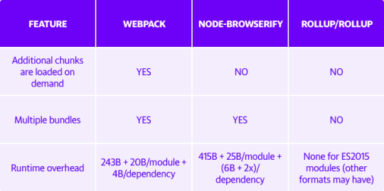
Comparison of webpack to other open source bundlers
How did we integrate webpack?
Like any developer does when integrating a new module bundler, we started integrating webpack into Yahoo Mail by looking at its basic config file. We explored available default webpack plugins as well as third-party webpack plugins and then picked the plugins most suitable for our application. If we didn’t find a plugin that suited a specific need, we wrote the webpack plugin ourselves (e.g., We wrote a plugin to execute Atomic CSS scripts in the latest Yahoo Mail experience in order to decrease our overall CSS payload**).
During the development process for Yahoo Mail, we needed a way to make sure webpack would continuously run in the background. To make this happen, we decided to use the task runner Grunt. Not only does Grunt keep the connection to webpack alive, but it also gives us the ability to pass different parameters to the webpack config file based on the given environment. Some examples of these parameters are source map options, enabling HMR, and uglification.
Before deployment to production, we wanted to optimize the javascript bundles for size to make the Yahoo Mail experience faster. webpack provides good default support for this with the UglifyJS plugin. Although the default options are conservative, they give us the ability to configure the options. Once we modified the options to our specifications, we saved approximately 10KB.
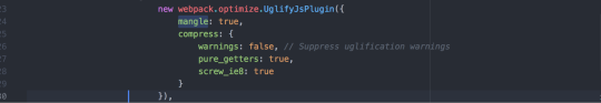
Code snippet showing the configuration options for the UglifyJS plugin
Faster development cycles for developers
While developing a new feature, engineers ideally want to see their code changes reflected on their web app instantaneously. This allows them to maintain their train of thought and eventually results in more productivity. Before we implemented webpack, it took us around 30 seconds to 1 minute for changes to reflect on our Yahoo Mail development environment. webpack helped us reduce the wait time to 5 seconds.
More reliability
Consumers love a reliable product, where all the features work seamlessly every time. Before we began using webpack, we were generating javascript bundles on demand or during run-time, which meant the product was more prone to exceptions or failures while fetching the javascript bundles. With webpack, we now generate all the bundles during build time, which means that all the bundles are available whenever consumers access Yahoo Mail. This results in significantly fewer exceptions and failures and a better experience overall.
Better Performance
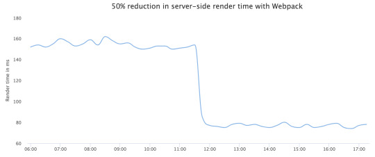
We were able to attain a significant reduction of payload after adopting webpack.
Reduction of about 75 KB gzipped Javascript payload
50% reduction on server-side render time
10% improvement in Yahoo Mail’s launch performance metrics, as measured by render time above the fold (e.g., Time to load contents of an email).
Below are some charts that demonstrate the payload size of Yahoo Mail before and after implementing webpack.
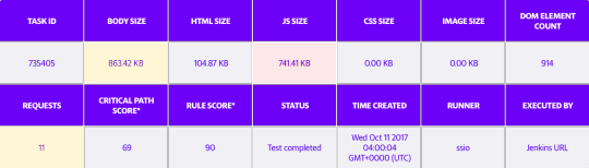
Payload before using webpack (JavaScript Size = 741.41KB)
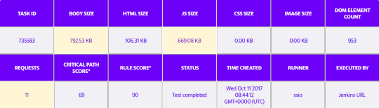
Payload after switching to webpack (JavaScript size = 669.08KB)
Conclusion
Shifting to webpack has resulted in significant improvements. We saw a common build process go from 30 seconds to 5 seconds, large JavaScript bundle size reductions, and a halving in server-side rendering time. In addition to these benefits, our engineers have found the community support for webpack to have been impressive as well. webpack has made the development of Yahoo Mail more efficient and enhanced the product for users. We believe you can use it to achieve similar results for your web application as well.
**Optimized CSS generation with Atomizer
Before we implemented webpack into the development of Yahoo Mail, we looked into how we could decrease our CSS payload. To achieve this, we developed an in-house solution for writing modular and scoped CSS in React. Our solution is similar to the Atomizer library, and our CSS is written in JavaScript like the example below:

Sample snippet of CSS written with Atomizer
Every React component creates its own styles.js file with required style definitions. React-Atomic-CSS converts these files into unique class definitions. Our total CSS payload after implementing our solution equaled all the unique style definitions in our code, or only 83KB (21KB gzipped).
During our migration to webpack, we created a custom plugin and loader to parse these files and extract the unique style definitions from all of our CSS files. Since this process is tied to bundling, only CSS files that are part of the dependency chain are included in the final CSS.
18 notes
·
View notes
Text
Getting Started with SVG
Scalable Vector Graphics (SVG) is an image format whose specification is defined by the W3C. SVG describes two-dimensional vector graphics using XML markup. You can think of it as the HTML equivalent for images.
Instead of defining images with columns and lines of pixels, SVG uses geometric primitives such as points, lines, curves and polygons to represent the image. This is what we call vector graphics. The difference is in the way these images work when we increase their size. Since vector images use mathematical expressions to resize the graph, we have no loss in defining the image.
Focusing on SVG, we have other advantages:
As they are text files, we can serve the images with gzip, which has an excellent compression factor.
Works great on high-density screens such as those on the iPhone and MacBook Pro Retina.
It may be manipulated through JavaScript.
But not everything is beautiful. Depending on the browsers you need to support, you might have to fallback to raster images, such as PNG. Internet Explorer only started supporting SVGs from version 9 and in Android 2.3, for example, it is not supported. SVG performance can also be a problem if you need to animate many images simultaneously. This is not the case with raster images.
Creating SVG Files
Although SVG files are only XML, you are much more likely to use a vector image editor to create your graphics. The most common alternatives are Adobe Illustrator and Inkscape, but on the Mac there is another very good alternative called Sketch.
SVG works best when the image is not that complex. This is because its size can increase a lot depending on what you are going to do; solid colors are much smaller than gradients, for example. This does not mean that you cannot have complex graphics but keep the file size issue in mind if you are going to use this SVG on a website.
If you use Adobe Illustrator, there are some things you can do to reduce this complexity when exporting SVG. Other applications may have similar functionality, but I don't know how each of them works.
The first thing to do is to expand the graphics, modifying the attributes that define its appearance and other properties of elements that are within it. This will also help with things like opacity and gradients, although it doesn't always work well.
Select the graph, go to the Object > Expand menu. If the chart has defined appearance attributes, you will need to select Object > Expand Appearance first.
Expanding Graphics in Illustrator
Another thing you can do is put the different parts of the chart together. Display the Pathfinder options panel at Window > Pathfinder and choose the "Merge" option. Sometimes the graph changes (things like opacity stop working) and we undo that option.
Always set the artboard close to the graphic. This can be done easily through the Object > Artboards > Fit to Artwork Bounds option.
Finally, when exporting, there are also some things to do.
Choose the SVG 1.1 profile, which has the greatest compatibility between browsers. The SVG Tiny 1.1 profiles and variations are aimed at mobile devices but do not yet have good support.
If you don't need to manipulate text dynamically, convert all fonts to objects. This will make the text retain the characteristics you have defined, without increasing the final file size, since for all intents and purposes the texts will only be objects.
Files exported by editors can be optimized. The files generated by Illustrator, for example, always have elements that can be removed, in addition to redundant attributes. You can use a tool like SVGO to automate this optimization process.
To install it, you will need Node.js.
npm install -g svgo
Now, run the following command to optimize the SVG:
svgo logo.svg logo.min.svg
Ready! Now just add SVG to your HTML document.
Adding SVG to HTML
There are a few different ways to add SVG to HTML. The simplest way is to use the <img> tag to do this.
<img src="logo.svg" alt="My logo">
The <object> tag also works very well.
<object type="image/svg+xml" data="logo.svg"></object>
Finally, you can add the <svg> tag directly to your document. Just open the file and copy the <svg> element.
This method has advantages and disadvantages. The main advantage is that you can manipulate the background color and borders of SVG elements with CSS, for example.
circle { fill: blue; }
The disadvantage, however, is that you can no longer rely on the browser cache since the element will be added directly to the document.
You can also use SVG as background images. To do this, just reference the file as you already do with PNGs, for example.
.logo { background: url(logo.svg) no-repeat; height: 356px; width: 408px; }
A very common technique is to encode the SVG in Base64 and add it directly to the CSS file. You can do this using the base64 command, available on * nix systems. Sorry, Windows users, I have no idea how that works in Windows.
$ base64 sample.svg | pbcopy
With this content in hand, we can now add this directly to the CSS, using data URIs.
.logo { width: 20px; height: 20px; background: url(data:image/svg+xml;base64,PHN2ZyBpZD0iQ2FwYV8xIiBlbmFibGUtYmFja2dyb3VuZD0ibmV3IDAgMCA1MTIgNTEyIiBoZWlnaHQ9IjUxMiIgdmlld0JveD0iMCAwIDUxMiA1MTIiIHdpZHRoPSI1MTIiIHhtbG5zPSJodHRwOi8vd3d3LnczLm9yZy8yMDAwL3N2ZyI+PGc+PHBhdGggZD0ibTEyMCAyNTZjMC0yNS4zNjcgNi45ODktNDkuMTMgMTkuMTMxLTY5LjQ3N3YtODYuMzA4aC04Ni4zMDhjLTM0LjI1NSA0NC40ODgtNTIuODIzIDk4LjcwNy01Mi44MjMgMTU1Ljc4NXMxOC41NjggMTExLjI5NyA1Mi44MjMgMTU1Ljc4NWg4Ni4zMDh2LTg2LjMwOGMtMTIuMTQyLTIwLjM0Ny0xOS4xMzEtNDQuMTEtMTkuMTMxLTY5LjQ3N3oiIGZpbGw9IiNmYmJkMDAiLz48cGF0aCBkPSJtMjU2IDM5Mi02MCA2MCA2MCA2MGM1Ny4wNzkgMCAxMTEuMjk3LTE4LjU2OCAxNTUuNzg1LTUyLjgyM3YtODYuMjE2aC04Ni4yMTZjLTIwLjUyNSAxMi4xODYtNDQuMzg4IDE5LjAzOS02OS41NjkgMTkuMDM5eiIgZmlsbD0iIzBmOWQ1OCIvPjxwYXRoIGQ9Im0xMzkuMTMxIDMyNS40NzctODYuMzA4IDg2LjMwOGM2Ljc4MiA4LjgwOCAxNC4xNjcgMTcuMjQzIDIyLjE1OCAyNS4yMzUgNDguMzUyIDQ4LjM1MSAxMTIuNjM5IDc0Ljk4IDE4MS4wMTkgNzQuOTh2LTEyMGMtNDkuNjI0IDAtOTMuMTE3LTI2LjcyLTExNi44NjktNjYuNTIzeiIgZmlsbD0iIzMxYWE1MiIvPjxwYXRoIGQ9Im01MTIgMjU2YzAtMTUuNTc1LTEuNDEtMzEuMTc5LTQuMTkyLTQ2LjM3N2wtMi4yNTEtMTIuMjk5aC0yNDkuNTU3djEyMGgxMjEuNDUyYy0xMS43OTQgMjMuNDYxLTI5LjkyOCA0Mi42MDItNTEuODg0IDU1LjYzOGw4Ni4yMTYgODYuMjE2YzguODA4LTYuNzgyIDE3LjI0My0xNC4xNjcgMjUuMjM1LTIyLjE1OCA0OC4zNTItNDguMzUzIDc0Ljk4MS0xMTIuNjQgNzQuOTgxLTE4MS4wMnoiIGZpbGw9IiMzYzc5ZTYiLz48cGF0aCBkPSJtMzUyLjE2NyAxNTkuODMzIDEwLjYwNiAxMC42MDYgODQuODUzLTg0Ljg1Mi0xMC42MDYtMTAuNjA2Yy00OC4zNTItNDguMzUyLTExMi42MzktNzQuOTgxLTE4MS4wMi03NC45ODFsLTYwIDYwIDYwIDYwYzM2LjMyNiAwIDcwLjQ3OSAxNC4xNDYgOTYuMTY3IDM5LjgzM3oiIGZpbGw9IiNjZjJkNDgiLz48cGF0aCBkPSJtMjU2IDEyMHYtMTIwYy02OC4zOCAwLTEzMi42NjcgMjYuNjI5LTE4MS4wMiA3NC45OC03Ljk5MSA3Ljk5MS0xNS4zNzYgMTYuNDI2LTIyLjE1OCAyNS4yMzVsODYuMzA4IDg2LjMwOGMyMy43NTMtMzkuODAzIDY3LjI0Ni02Ni41MjMgMTE2Ljg3LTY2LjUyM3oiIGZpbGw9IiNlYjQxMzIiLz48L2c+PC9zdmc+) }
With this technique we can count on the browser's cache and load the graphics in a single request — but keep an eye on the file size as it can easily get too big.
Compression
Because it is a text-based file, SVG has an excellent compression factor. A 10KB file, for example, drops to 3.2KB when served with gzip.
If you use the Data URI technique, a file containing 13KB drops to 4.9KB when served with gzip.
Fallback
The drawback is that if you need to support IE8, you will need to fallback to PNGs, for example. A simple way to do this is to use the images' onerror event, which is launched when an SVG tries to load. Just add the function below to <head> and define the event in the images.
<script> function toPNG(image) { image.onerror = null; image.src = image.src.replace(/\.svg$/, ".png"); } </script> <img src="logo.svg" alt="Logo" onerror="toPNG(this);">
Another technique that can be used is with the <object> tag. It is possible to define content that will be rendered if the browser does not support SVG. One problem with this technique is that the PNG image is always loaded, even when the browser supports SVG.
<object data="logo.svg" type="image/svg+xml"> <img src="logo.png" alt="Logo"> </object>
In the case of background images, I use Modernizr. When a browser that does not support SVG is detected, a no-svg class is added to the <html> tag, allowing you to display the PNG conditionally.
.logo { background-image: url(logo.svg); } .no-svg .logo { background-image: url(logo.png); } In Conclusion
SVGs are almost always small, do not need a larger version for Hi-DPI screens and they have an excellent compression factor.
The sprite issue may not be that simple, but it is possible. Alternatively, you can use Data URIs, which will also be served with gzip.
Take a test. The chances of you wanting to use it for everything are great!
About the Author
Diogo Souza works as a Java Developer at PagSeguro and has worked for companies such as Indra Company, Atlantic Institute and Ebix LA. He is also an Android trainer, speaker at events on Java and mobile world.
Visit our website here
svg cut files
0 notes
Photo

What's the carbon footprint of your website?
#426 — February 5, 2020
Read on the Web
Frontend Focus
CO2 Emissions On The Web — Sites are said to now be four times bigger than they were in 2010. This post looks at the energy costs of data transfer and what you can do to reduce your web carbon footprint.
Danny van Kooten
Old CSS, New CSS — This is a tale of one individuals personal history with CSS and web design, offering a comprehensive, detailed “blend of memory and research”. A great trip down memory lane for any of you who got started on the web in the 90s.
Evelyn Woods
Open-Source Serverless CMS Powered by React, Node & GraphQL — The way we build, deploy and operate the web is evolving. Webiny is a developer-friendly serverless CMS. Use it to build websites, APIs and apps and deploy them as microservices. SEO-friendly pages and fast performance. View on GitHub.
Webiny sponsor
How Smashing Magazine Manages Content: Migration From WordPress To JAMStack — An interesting look at how a big site like Smashing Magazine went about migrating from WordPress to a static infrastructure. This technical case study covers the gains and losses, things the Smashing team had wished they’d known earlier, and what they were surprised by.
Sarah Drasner
▶ What’s New in DevTools in Chrome 80 — New features include improved WebAssembly debugging, network panel updates, support for let and class redeclarations and more.
Google Chrome Developers
A New Technique for Making Responsive, JavaScript-Free Charts — There are countless libraries for generating charts on the web, but they all seem to require JavaScript. Here’s how the New York Times approached JS-free charts with SVG.
Rich Harris
Bringing The Microsoft Edge DevTools to More Languages
Erica Draud (Microsoft)
💻 Jobs
Frontend Developer at X-Team (Remote) — Work with the world's leading brands, from anywhere. Travel the world while being part of the most energizing community of developers.
X-Team
Find a Dev Job Through Vettery — Vettery is completely free for job seekers. Make a profile, name your salary, and connect with hiring managers from top employers.
Vettery
📙 News, Tutorials & Opinion
HTML Attributes to Improve Your Users' Two Factor Authentication Experience — How to use the HTML autocomplete, inputmode and pattern attributes to improve the user experience of logging in.
Phil Nash
▶ Exploring the Frontend Performance of the UK's National Rail Website — Runs through using the layers panel in Chrome DevTools to diagnose performance issues on a high traffic website.
Umar Hansa
Transitioning Hidden Elements — Paul Hebert has written a little JavaScript utility to wrap up all of the intricacies of dealing with transitioning hidden elements - often tricky as they’re not in the document flow.
Cloud Four

How I Recreated A Polaroid Camera with CSS Gradients Only — A high-level tutorial showing how to recreate physical products with just CSS. The end result here is a Polaroid camera made entirely out of gradients.
Sarah L. Fossheim
The React Hooks Guide: In-Depth Tutorial with Examples. Start Learning — Learn all about React Hooks as we comprehensively cover: State and Effects, Context, Reducers, and Custom React Hooks.
Progress KendoReact sponsor
How To Create A Headless WordPress Site On The JAMstack
Sarah Drasner & Geoff Graham
Using the CSS line-height Property to Improve Readability
William Le
Possibly The Easiest Way to Run a Static Site Generator
CSS Tricks
Getting Keyboard-focusable Elements — A quick JavaScript function for managing focus.
Zell Liew
Shopping for Speed On eBay — This case study explains how eBay increased key metrics by optimizing the performance of their web/app experiences.
Addy Osmani
How We Started Treating Frontend Performance as a Feature — A non-technical guide to the decisions HubSpot made (and the tools they now utilise) that helped them start treating frontend performance as a feature.
Adam Markon
🔧 Code, Tools and Resources

LegraJS — Lego Brick Graphics — A small (3.36KB gzipped) JS library that lets you draw using LEGO like brick shapes on an HTML <canvas> element.
Preet Shihn
massCode: A Free and Open Source Code Snippets Manager
Anton Reshetov
Axe Pro: Free Accessibility Testing Tool Created for Development Teams
Deque sponsor
micro-jaymock: Tiny API Mocking Microservice for Generating Fake JSON Data
Meeshkan
Craft 3.4 is Here — Version 3.4 of this paid CMS brings improvements to user experience, collaboration, GraphQL, and more.
Craft
🗓 Upcoming Events
Flashback Conference, February 10-11 — Orlando, USA — Looks at cutting-edge web dev, browser APIs and tooling, but adds how they’ve evolved from the past to the web of today.
Frontend Developer Love, February 19-21 — Amsterdam, Netherlands — Three full days of talks from 35+ global JavaScript leaders from around the world.
ConveyUX, March 3-5 — Seattle, USA — This West Coast user experience conference features over 65 sessions across three days.
W3C Workshop on Web & Machine Learning, 24-25 March — Berlin, Germany — Hosted by Microsoft, this free event aims to “bring together providers of Machine Learning tools and frameworks with Web platform practitioners to enrich the Open Web Platform with better foundations for machine learning”.
by via Frontend Focus https://ift.tt/31qlvPZ
0 notes
Text
24 maja 2019

◢ #unknownews ◣
Kolejny zapracowany tydzień, więc znów publikuj�� zestawienie w piątek - najważniejsze jednak, że się udało!
1) Tworzenie gry komputerowej używającej favicony jako canvasa (film ~5 minut) https://www.youtube.com/watch?v=kZFhm7aW8A4 INFO: obraz gry wyświetla się po prostu jako ikona na Twojej karcie w przeglądarce
2) Microsoft zupełnie odnowił swoją aplikację terminala - przegląd zmian (film ~1h) https://www.youtube.com/watch?v=KMudkRcwjCw
3) Śledzenie kursora myszy w czystym CSS - wyłączenie JavaScriptu już Ci nie pomoże https://www.bleepingcomputer.com/news/security/researcher-finds-css-only-method-to-track-mouse-movements/ INFO: warto zobaczyć załączony film aby zrozumieć jak to wygląda
4) MVP (Minimal Viable Product) vs MVaP (Minimal Valuable Product) - czym to się różni? https://www.toptal.com/designers/product-design/minimum-valuable-product INFO: fajnie wyjaśnia to załączona grafika przedstawiająca proces budowy samolotu
5) Brotli - nowa metoda kompresji treści webowych, kilkanaście procent skuteczniejsza od GZIP https://web.dev/codelab-text-compression-brotli INFO: to tutorial przedstawiający, jak wdrożyć Brotli w NodeJS (z użyciem Express)
6) Tworzenie interfejsu webowego, który dobrze wygląda w... terminalu https://medium.com/@atulanand94/building-web-based-uis-for-terminals-using-javascript-60b5eee31213 INFO: wiem, że tytuł brzmi dość przewrotnie, ale gdy zobaczysz przykłady, od razu zrozumiesz o co chodzi
7) Jak oczyścić Facebooka ze 'śmieci' (Fanpage, których nie obserwujemy, grupy w których nie uczestniczymy itp) https://siadlak.com/jak-oczyscic-facebooka-ze-smieci/ INFO: rozwiązanie opiera się o użycie rozszerzenia do Chrome, które pozwoli nam na wykonywanie niektórych operacji hurtem
8) Wprowadzenie do "JAMstacka", czyli jak stworzyć nowoczesną stronę https://medium.freecodecamp.org/an-introduction-to-the-jamstack-the-architecture-of-the-modern-web-c4a0d128d9ca INFO: JavaScript + API + Markup. Nowoczesne podejście do tworzenia stron WWW
9) Zbiór najlepszych bibliotek do tworzenia wykresów w JavaScript https://medium.freecodecamp.org/these-are-the-best-javascript-chart-libraries-for-2019-29782f5e1dc2 INFO: większość z tych bibliotek może być używana za darmo w niekomercyjnych projektach
10) Bądź bezpieczniejszy w necie - checklista bezpieczeństwa. Zobacz koniecznie https://securitycheckli.st INFO: wykonaj wszystkie podpunkty z listy aby podnieść swoje bezpieczeństwo przy korzystaniu z usług sieciowych
11) Docker dla absolutnie początkujących - wytłumaczone od zera, na przykładach (długie) https://morioh.com/p/21e3236f275d/docker-for-absolute-beginners
12) Trzy 'plemiona' programistów - poeci, hackerzy i twórcy - jak patrzą sprawę kodu źródłowego czy interface użytkownika https://josephg.com/blog/3-tribes/ INFO: interesujące przemyślenia. Warto rzucić okiem.
13) Debugowanie programu w VIMie - krok po kroku (na przykładzie programu w C) https://www.dannyadam.com/blog/2019/05/debugging-in-vim/ INFO: mówi się, że VIM jest świetnym środowiskiem programistycznym. Podpowiada kod, sprawdza składnie, a jak radzi sobie z debugowaniem?
14) Już 22 czerwca ruszają zapisy na Google CTF 2019 - konkurs związany z branżą security. Zapisz się już dziś https://capturetheflag.withgoogle.com INFO: zadania będą z kategorii: web, reverse-engineering, kryptografia itp.
15) Jak wygląda "Code Review" w tak dużej korporacji jak Microsoft? (ponad 60k programistów) https://www.michaelagreiler.com/code-reviews-at-microsoft-how-to-code-review-at-a-large-software-company/ INFO: Jakiego softu używają do Code Review? kto przegląda kod? jak często?
16) Raport Najwyższej Izby Kontroli (NIK) dotyczący stanu bezpieczeństwa danych w polskich urzędach (jest źle!) https://www.nik.gov.pl/aktualnosci/zeby-elektronicznie-znaczylo-bezpiecznie.html INFO: "(...) blisko 70 proc. skontrolowanych urzędów nie radziło sobie z zapewnieniem bezpieczeństwa przetwarzania informacji"
17) Zastąp Google Analytics za pomocą GoAccess - zadowoli userów chcących odciąć się od usług Google https://benhoyt.com/writings/replacing-google-analytics/ INFO: bardzo ciekawy sposób śledzenia użytkowników na stronie z użyciem bucketów S3, CloudFronta i pythona.
18) Play Date - nowa konsola do gier. Kosztuje $149 i wejdzie na rynek w 2020 roku https://play.date/ INFO: konsola posiada interesujący mechanizm korbki, który całkiem zgrabnie współpracuje z wydaną na konsolę grą o podróżach w czasie (kręcenie w jedną stronę przenosi w przyszłość, a w drugą w przeszłość)
19) Jak wyświetlać powiadomienia z aplikacji webowej na pulpicie usera? (tutorial) https://dev.to/attacomsian/how-to-show-desktop-notifications-using-javascript-5aco INFO: bardzo zgrabny i zwięzły wstęp do Notification API.
20) Jak połączyć dwie tabele w JavaScript i dlaczego Array.push() jest 945 razy szybsze od Array.concat()? https://dev.to/uilicious/javascript-array-push-is-945x-faster-than-array-concat-1oki INFO: niby push() jest super szybki, ale z artykułu i tak wynika, że własne rozwiazanie jest jeszcze szybsze
21) SCAR - czyli hostuj swoją statyczną stronę na infrastrukturze AWS za pomocą JEDNEGO kliknięcia https://github.com/cloudkj/scar INFO: wystarczy tylko kliknąć w żółty przycisk. Utworzą się niezbędne buckety S3, podepnie się domena do Route 53, wygeneruje certyfikat itp. (koszt utrzymania całości to <$1/msc)
22) Używanie 'await' oraz 'async' w JavaScript nie jest takie trudne - no chyba, że umieścisz je w pętli... https://medium.freecodecamp.org/javascript-async-and-await-in-loops-30ecc5fb3939 INFO: wrzucenie operacji używających await/async do pętli może spowodować pewne problemy. Poczytaj jakie i jak je rozwiązać
23) Wstęp do AWS Lambda + Python. Czyli rozpoczynamy przygodę z technologią ServerLess https://medium.com/@emlynoregan/getting-started-with-lambda-on-aws-in-2018-using-python-3ed34c48671c INFO: AWS daje Ci 1mln (tak, MILION!) wykonań lambdy miesięcznie za darmo, więc prawdopodobnie ta zabawa będzie Cię kosztować $0
24) Lista 10 kanałów na Youtube, które powinieneś obserwować jako Junior Developer/Designer https://dev.to/desoga/10-youtube-channels-to-follow-as-a-junior-web-developer-designer-2fal INFO: wszystkie są oczywiście anglojęzyczne, a wielu z nich prawdopodobnie nie znałeś
25) Opal - aplikacja kompilująca kod źródłowy Ruby do JavaScript http://opalrb.com INFO: na stronie są przykładowe kody źródłowe na których możesz eksperymentować (kliknij tylko 'Try this code')
26) Metoda some() w JavaScript - co to jest i jak jej używać? https://dev.to/mattsparks/quick-javascript-tip-the-some-method-207j INFO: to metoda, która sprawdza, czy przynajmniej jeden z elementów tablicy pasuje do wzorca
27) Przemyślenia po 10 latach pracy zdalnej https://blog.viktorpetersson.com/2019/05/18/a-decade-of-remote.html INFO: wartościowe informacje dla kogoś kto taką pracę rozważa. Opisuje sprawy istotne dla pracownika jak i firmy chcącej w ten sposób funkcjonować.
28) Jak zarobiłem $18000 tworząc statyczną stronę WWW - czyli do czego prowadzi korporacyjny nieład https://idiallo.com/blog/18000-dollars-static-web-page INFO: wciągająca historia odnośnie wyliczania czasu pracy, przestrzegania procedur i absurdów dużych firm
29) Analiza treści 300 ogłoszeń o pracę dla developerów JS - statystyka poszukiwanych technologii, bibliotek itp https://cvcompiler.com/blog/game-of-frameworks-javascript-trends-of-2019/ INFO: 267 na 300 ogłoszeń wspomina o React. Znajomości GITa to też must-have w obecnym świecie
30) Tutorial w którym stworzymy bezpieczne API w Node.js przy użyciu Expressa. Jest to API w standardzie GraphQL https://www.toptal.com/graphql/graphql-nodejs-api INFO: tekst zawiera nie tylko praktykę, ale też trochę teorii - np. porównanie GraphQL z typowym RESTowym API
== LINKI TYLKO DLA PATRONÓW ==
31) Linki do 10 darmowych wideo kursów Dockera z platformy Udemy dla początkujących i średnio zaawansowanych http://uw7.org/un_5ce7937443ae7 INFO: nie wiem jak długo te kursy będą dostępne za darmo, więc trzeba się spieszyć i do nich dołączyć
32) Optymalizacja zapytania SQL z wersji wykonującej się 24 minuty do takiej, która zwraca wynik w... 2 sekundy http://uw7.org/un_5ce7936f01e80 INFO: opis procesu myślowego i kolejnych kroków optymalizacji. Interesujące dla ludzi zafascynowanych tematem przetwarzania dużej ilości danych
33) Lista wszystkich exploitów 0-day pozostających na wolności - czyli czego możesz się obawiać w sieci http://uw7.org/un_5ce7936a1bfea
34) Chcesz zostać programistą Reacta? Naucz się go w przyspieszonym tempie w 48 krokach http://uw7.org/un_5ce79363c471a INFO: bardzo rozbudowany tekst, ale i zarazem niezwykle efektywna forma nauki. Świetne!
35) Porządki w repozytorium GIT, czyli operacja 'rebase' i wszystko co powinieneś o niej wiedzieć http://uw7.org/un_5ce7935d33102
--
Chcesz mieć dostęp do linków premium? To zostań patronem :)
https://patronite.pl/unknow
0 notes
Text
Some important CSS and JS Libraries
1. Styled components
An idea born in an Australian whisky bar has developed into a project of 18 K stars, widely embraced within the culture. Styled components make it simpler to use CSS in React components, by identifying styled components with encapsulated styles as a mediator layer without CSS classes. Styled-components are generated by literal notation using the ES6 framework to describe components. As you would normally do using CSS, CSS properties can be applied to the component as required. Styled components can create specific class names when the JS is parsed, and inject the CSS into the DOM. You will learn more about Max Stoiber in this great chat.
2. Radium
Radium is described as "A toolchain for React component styling" at 6.5 K stars and developed by FormidableLabs. With React without CSS, it's a collection of tools to handle inline types. Radium provides a simple interface and abstractions to manage CSS features that can not easily accommodate Radium inline styles, enabling you to bundle styles together with your React elements, combining javascript, html, and styling. It also provides rendering based on props, allowing you to design your components according to the state of your game.
3. AphroditeAphrodite is a framework-agnostic CSS-in-JS library with server-side rendering support, browser prefixing and limited CSS generation support. Aphrodite transforms everything into classes, using the class attribute.This project operates with or without Respond at 4 K stars and offers features such as modeled injection into the Dom, styles of auto prefixes and more, all at a fairly small size of 20k and a handful of dependencies. Here's a handy rundown of Aphrodite vs. Radium. 4. Emotion
At 4.2 K stars Emotion is a strong and versatile CSS-in-JS library that enables you to style string or object-based apps. To prevent variance problems with CSS it has uniform structure. Based on the glam library and its philosophy the concept is to maintain runtime output by parsing styles with babel and PostCSS while writing CSS. The core runtime is 2.3 kb, and 4 kb with support from React. Emotion isn't just about Reacting.
5. Glamorous
Note: the project is no longer actively maintained! still cool though :)
At 3.6 K stars, PayPal's Glamorous is focused to create styled components and jsxtyle inspired "maintainable CSS with React." Kent C. Dodds describes the project as "React component styling with an elegant (inspired) API, small footprint (< 5 kb gzipped) and great performance (through glamour)." It has a rather similar API to modeled parts, and under the hood it uses similar methods.
6. Glamor
Glamor, inspired by ideas from this great talk, is small and powerful. It helps you to write CSS inline in your components using the same supports for style prop Object CSS syntax React. It is fast and efficient, independent system, serverside / static rendering and adds vendor prefixes / fallback values. Here's a short introductory API notes, a comparison of Glamor CSS techniques and a helpful Glamor tutorial with Gatsby.
7. Fela
<FelaComponent style={{ backgroundColor: 'blue', color: 'red' }} render={({ className, theme }) => ( <div className={className}>I am red on blue.</div> )} />
Fela is a project developed in JavaScript for State-Driven Styling, highlighting 3 things: rendering styling dynamic by design, introducing framework-agnostic (Bindings for Reacting) and performing. Based on the state of the application it is adjustable by nature and renders types. It generates atomic CSS and supports all common features of CSS such as media queries, pseudo-classes, keyframes and font faces. It can be used on any view list, including the native React.
8. Styletron
Thanks to this
code-carrot post
Styletron is a "component-oriented styling toolkit" at 2500 stars. Styletron supports stateless, single-element styled components as primitive base styling with conditional / dynamic styling prop interfaces, and style composition via (typed) JavaScript objects without additional tooling (e.g. Webpack loaders, Babel plugins, etc.). The design of style objects is often un-opinioned on. This fascinating HN thread lets you know more.
9. JSSJSS is a CSS abstraction that uses JavaScript to define styles in a declarative and maintenable manner. It is a high performance compiler JS to CSS that operates both runtime and server-side. This core library is agnostic at low level and frame, and is around 6 KB (minified and gzipped). This can also be expanded by API plugins. Here's a good SCSS (Sass) conversion tutorial here. Test out even React-JSS, a React JSS integration.
10.
Bootstrap Icons
For their icon library the Bootstrap team recently published the Alpha 3 Update. The newest update adds tons of new designs and now has over 500 icons on the Bootstrap SVG icon pack. Bootstrap Icons are designed to interact with components in Bootstrap, from shape controls to navigation. Bootstrap icons are SVGs, so they can easily and quickly scale and be styled with CSS. Although built for Bootstrap, they will work in any project. They are open source (MIT), so you can access, use, and expand it free of charge. Heads up though, right now they are in alpha and open to drastic changes.
11.
Polka
This is my short analysis of Polka which is "... just a native HTTP server with added routing, middleware, and sub-applications support ...!" even though express is relatively light, polka is lighter. What I find fascinating in this approach gives you even more insight into how to build an application. I think Polka is an excellent way to express yourself. With only a few extra modules, you'll have a fully fledged system with stable paths, templating, static files providing in a more lightweight (and hopefully faster) bundle all you have in express. It has not the same express acceptance but this could be an advantage.
12.
Size limit
Open-source tool to measure the performance of JS apps that offers an estimation of how much time end-users will need to run your Javascript. It can be plugged into Travis CI, Circle CI, GitHub Behavior so it runs automatically and prevents over-budget size limit commits.
13.
Stryker
Stryker is a very fascinating project in JavaScript and other languages to run mutation testing. It works by adding "mutations" to the code and running tests on them in random locations, testing how many of the mutations pass and how stable the code really is. By an example let's explain this, Suppose you're creating an online casino. Users are only permitted to access the casino if they are over 18. So you write the following piece of code to test if anyone can access the site:
function isUserOldEnough(user) { return user.age >= 18; }
Stryker will find the return statement and decide to change it in several ways:
/* 1 */ return user.age > 18; /* 2 */ return user.age < 18; /* 3 */ return false; /* 4 */ return true;
We call such shifts mutants. After discovering the mutants, they are introduced one by one and the experiments are performed against them. If at least one of the experiments fails, we're saying the mutant is murdered. This is what we want to see! If no check fails, then it has succeeded. The better the experiments survive the fewer mutants.Stryker produces the results in various formats. One of the easiest reporters to read is the plain text:
Mutant killed: /yourPath/yourFile.js: line 10:27 Mutator: BinaryOperator - return user.age >= 18; + return user.age > 18; Mutant survived: /yourPath/yourFile.js: line 10:27 Mutator: RemoveConditionals - return user.age >= 18; + return true;
The direct text reporter outputs precisely how the code has been changed and which mutator has been used. It would then tell us whether a mutant has been killed which means that at least one test has failed, or whether it has survived. In this case the second mutation is marked as survivor. This means that a test that specifically checks for age younger than 18 is possibly lacking
14.
Dinero.js
Dinero is a JavaScript library designed to work with monetary values. It has a well-designed API which contains all the methods for money and currency operations you might need. Dinero.js allows the development, estimation and formatting of monetary values in JavaScript. You can do arithmetic operations, read and format them thoroughly, search for a variety of items to make your own creation process simpler and safer.
15.
Uppload
Uppload.js is a modern JavaScript library designed to enhance the experience of uploading images. The library offers an elegant interface for file collection that allows the user to drag-drop images from the locale.It also allows you to import images from any data source, such as URL, camera, Instagram post, Facebook public post, etc. Thanks to its plugin program, it provides multiple upload options, allowing you to add more image sources, such as Instagram, screenshots, Giphy and more.You are also allowed to crop, resize, rotate the client-side images until they are submitted to server.
16.
MoreToggels
Pure CSS library offering over 50 stylish checkbox toggles of a pleasant variety. These are very easy to use and customize-only surround a div in your checkbox, add the right class and it's done.
17.
μPlot
Fast, memory-efficient diagram library to generate superb 2D Canvas-based charts. It offers lots of different types of graphs, lots of customization options and other cool features.
18.
Rsup Progress
Easy but still very successful progress bar plugin with promising support and smooth animations. It is super easy to configure and very useful to show the load times at the top of the page. 19.
Bootstrap Treeview
Bootstrap treeview is used to represent hierarchical information starting with the root element and continuing with its children and their respective items. Besides the root every element has a parent and can have children. Easy Bootstrap 4 plugin designed to build elegant treeviews with collapse list objects. It's a fantastic little feature and we wouldn't be shocked to see it integrated with future Bootstrap models. Siblings are objects with one parent and the same. Objects can collapse and expand.
20.
Electron React Boilerplate
Electron React Boilerplate uses Electron, React, Redux, React Router, Webpack and React Hot Loader for rapid application creation (HMR).Great starting kit for the production of Electron-based cross-platform mobile applications. The project GitHub provides a strong framework to help you customize everything and get started in no time.
21.
Panolens
They're panolens. Js is a WebGL focused and event-driven panoramic viewer. Lean and versatile. It is constructed over Three. Amazing JavaScript panorama viewer library right in the browser to create beautiful 360 ° experience. Three.js-based library keeps output fast and smooth, even when viewing high quality images or videos.
22.
Octomments
Very smart solution for adding comments to your website which uses GitHub as a discussion source. The project consists of a GitHub App and a JS library working together to view a fully featured comment section, hosted within a selected repo issue of GitHub.
23.
Rome
Rome is a toolchain experimental to JavaScript. It includes a parser, linter, formatter, bundler, frame checking and more. It aims to be a detailed platform for everything that relates to JavaScript source code production. Rome is not a set of known instruments. All the tools are designed specifically for Rome, do not rely on any external dependencies and are made to communicate with each other seamlessly.
24.
massCode
MassCode is a snippet manager for developers of open-source code. This nice little app offers a clean interface for all of your code snippets and cheatsheets to handle. Runs on Mac, Linux and Windows.
25.
Bootlint
The Bootstrap team's new linter tool that lets you test if your pages use Bootstrap's components with properly organized HTML. It also ensures the appropriate tags are used, an HTML5 doctype declaration is included, and the page's overall markup is accurate.
26.
DarkModeJS
This library uses the mix-blend-mode css to get Dark Mode on all of your websites. Only copy and paste the snippet and you'll get a plugin to turn the Dark Mode on and off. You can also use it programmatically, without the button. Lightweight module, installed in Vanilla. Super lightweight JS library to help you integrate dark & light teams into your applications. It senses local time for the user and changes the UI appearance accordingly. It doesn't have light and dark themes.
27.
Hex Engine
Modern 2D engine designed to render browser games. This versatile toolkit for game development features a Canvas-based rendering engine, aids in physics and sound, gamepad support, integrated design tools, and more.
28.
Chardin.js
A tiny JS tool which makes adding overlay instructions for your apps super simple. These guides can be extremely helpful to clarify the UI, demote the various features of the app or simply show the user what to do next.
29.
Sharect
Share. Js is a lightweight, zero-dependent JS library that transforms any text selected into quotes that can be posted on Twitter and/or Facebook, as you can see in Medium.com.
30.
Lottie
Lottie is an Android, iOS, Web, and Windows library that parses Adobe After Effects animations exported as json with Bodymovin and makes them natively accessible on the smartphone and on the web! The Airbnb developer team's incredible library that exports Adobe After. This makes animations that can be very complex with lots of details and keyframes as well as being super-performing and smooth buttery. It's now designed to expand its use to android, iOS, React Native and Windows in addition to his great work.
31.
Vue Interactive Paycard
View-Interactive-Paycard-Smooth and sweet micro-interaction credit card shape. Includes the printing of numbers, validation and automatic identification of type of token. Designed with viewjs, and completely sensitive as well. Very impressive credit card snippet type which beautifully animates as users input their data. One of the finest projects we've seen all year round, with everything polished to perfection, from the typography to the animations. It's not only pretty either-the card is also very user friendly with the formatting of numbers, validation and the identification of card size. Also, when entering cc info, users actually prefer a well-known interface and not some custom UI.
32.
Cube.js
Cube.js is a scalable open source platform for building analytical web applications and designing your own sophisticated, custom analytics systems. It consists of a wide SDK frontend and a lightweight API backend which can be linked to most databases and systems like MySQL, Postreges and MongoDB .. It is primarily used for developing internal business intelligence tools or for applying customer-facing analytics to an existing app.
33.
Tessaract
Tesseract. Js is the pure Javascript port of Tesseract's popular OCR engine. Node and browser JavaScript library which extracts text from images. It analyzes the image, automatically detects location and orientation of the text, and with great precision extracts words and sentences. Tessaract can recognize more than 60 languages including more complex ones such as Chinese, Arabic and Russian
34.
Barba
Lightweight library for linking seamless transitions to pages on your website. It takes up your usual static website and makes it a great-looking single-page application experience. It helps to reduce the delay between loading pages, to decrease requests for HTTP, and to make the web feel more premium.
35.
Freezeframe
This fun JavaScript library allows for the control of animated GIF playback. It can start and pause the GIFs, for example, based on user feedback such as clicks or hover. As it uses a canvas feature to draw the individual frames, it is also very performant under the hood.
36.
Ink
React-based App building command line interface. It provides a great range of predefined components which can be used to accelerate the creation of terminal interfaces while also allowing features such as more sophisticated templates and controls to be added.
37.
Instant Page
This fun library speeds up loading times when users hover over them by prefretching the links. This makes loading of a page faster until the user clicks on a connection and navigates to the next page. With the latest update it can also automatically prefix all links in a list-great for static content.
38.
Filepond
FilePond is a JavaScript library that lets you upload silky smooth drag n 'drop files. It has a polished UI which is a pleasure to use, while also offering some interesting features under the hood such as optimizing photos for quicker uploads. Just 21 kB gzipped, with adapters available with React, Vue, and jQuery for easier implementation. These docs can assist in downloading, setting up, updating and extending FilePond. If you don't know FilePond you can find more detail on the FilePond product page.
39.
Micromodal
Micromodalistic. Js is a modal library written in pure JavaScript, lightweight, configurable and 11y-enabled. It helps you to build modal dialogs consistent with WAI-ARIA guidelines, with trust and with minimal configuration. Minified and gzipped at just 1.9 kb, it's a tiny library for big change.
40.
Brain.js
A great project for all of you who want to take their first steps in machine learning, Brain.js offers a powerful framework for working in a JavaScript environment with the neural networks. It has lots of examples of excellent documentation that will help you understand some of the most important ML techniques.
As a reputed Software Solutions Developer we have expertise in providing dedicated remote and outsourced technical resources for software services at very nominal cost. Besides experts in full stacks We also build web solutions, mobile apps and work on system integration, performance enhancement, cloud migrations and big data analytics. Don’t hesitate to
get in touch with us!
#b2b seo
#b2bservices
#b2b ecommerce
#b2bsales
0 notes
Text
15 Interesting JavaScript and CSS Libraries for April 2018
Our mission at Tutorialzine is to keep you up to date with the latest and coolest trends in web development. That’s why every month we release a handpicked collection of some of the best resources that we’ve stumbled upon and deemed worthy of your attention.
Radi is a fast and easy to use front-end javascript framework. It offers a simple way to build single-page or more complex applications. It is really tiny, only 3kb minified and gzipped, doesn't use any diffing algorithms or virtual dom, and requires no dependencies.

This is a JavaScript library for uploading any type of files. You can drop or copy and paste files, browse the filesystem or just use the API. It works with directories, local and remote URLs, and blobs. The library has a built in image optimization and automatic image resizing and cropping.
This is an open-source Bootstrap 4 Dashboard Theme. It is completely responsive, easy to integrate, follows the Bootstrap's coding conventions, and has a number of different customizable components to choose from. Tabler has great support for all modern browsers.

With Driver.js you can highlight items on your page, in order to attract the users attention. It is user-friendly, extremely lightweight and highly customizable. The library is licensed under MIT and works well on all browsers.

Rough.js is a lightweight canvas based library that can be used for drawing figures and shapes as if they were hand-drawn. It offers tools for drawin lines, curves, arcs, polygons and other shapes. The library also supports drawing SVG paths.
With this library you can print horizontal bar charts in your terminal. It is really simple to work with. You just need to pass an array in the command line, and the library will generate good lookin charts with legend and scale.

This is an open-source JavaScript library for creating beautiful charts for data visualization. It supports a large number of chart types such as bar, line, pie, heatmap and more. They are easy to use, highly customizable and work great on all browsers including IE8.
Material Design Icons is a simple, modern and beautiful icon set created by Google. It includes more than 900 icons, customized only with CSS. The icons are vector-based and look great on all screensizes, retina displays and low-dpi screens.
This is a modern, modular tool for compressing CSS files. It takes your CSS files and performs a number of optimizations, to compress your code as much as possible for a production environment. It removes whitespace, comments, unnecessary definitions and duplicate styles.
This is a JavaScript library for capturing keyboard input and key presses. It is very simple and user-friendly, has no dependencies and works on IE 6+, Safari, Firefox and Chrome. Special care must be taken when using it alongside other libraries, as it might interfere with keyboard handling.

TensorFlow is an open-source library for defining,training and deploying machine learning models in your browser. It allows you to build neural networks from scratch using high-level APIs and import, run and retrain existing models. What is more, TensorFlow supports WebGL and can work with GPU acceleration.

With Hover.css you can add a wide variety of hover effects and animations to links, buttons and images in your page. The code is self-contained and you can copy-paste it directly in your project, and is available in CSS, Sass and Less. The effects may not work on older browsers, because most of them use CSS3 features like transorms and transitions.

Sympact is a minimal library for calculating the CPU and memory usage of tasks in Node.js. It executes a script and evaluates its execution time, CPU usage, and memory usage, then returns a report containing the averages of the results. In addition, it comes with a CLI for a better user experience.

Leaflet is an open-source library for creating interactive maps. It offers some of the most important features for a map library like markers, layers, zooming and many more. It works on all major desktop and mobile platforms, has no external dependencies, and can be extended with a large number of plugins.

This is a functional promise library built with async/await. It is an alternative to the Bluebird.js library. What is more, it supports Tree Shaking, which means that you can use only the modules that you need and leave the rest, so it could end up really small in size.
Presenting Bootstrap Studio
a revolutionary tool that developers and designers use to create beautiful interfaces using the Bootstrap Framework.
Learn more
via Tutorialzine https://ift.tt/2Gxz7BB
0 notes
Text
8 Blog Design Tips to Make Sure People Stop to Read Your Content
Most people determine whether to stay on or leave a site in the first few seconds. If you want your blog’s visitors to stay for longer and read your content, you need your site to leave a great first impression. Your site needs to look elegant, be easy to navigate, and show off useful and informative content. By focusing on these three things, you can make your site much more marketable to potential readers. If your user experience strategy is effective enough, you may even get your visitors to sign up for email updates or to purchase your products.
In this post, we’ll give you some tips on how to improve the user experience of your blog so people stay to read and share your content.
Don’t make it hard
These tips will focus on some specific techniques, but they all revolve around two themes, which is reducing your reader’s effort and site performance. Visitors should be able to browse your site without any effort at all. Content should be organized intuitively. In order to do this, you will need to anticipate their needs. You should not expect them to make the effort to understand how your website is arranged. It is up to you to make it simple for them. Everything they see should already be optimized.
Don’t make them wait
This leads us to our second point. That means that you need to improve performance as much as you can. Your website must load quickly. Your audience does not enjoy waiting around for webpages to load, and studies show that delays of more than one to two seconds significantly affect user experience because they interrupt the user’s train of thought.
Keep these two things in mind as you work on user experience for your blog. In the meantime, here are 8 blog design tips you can do to improve it.
1. Reduce your blog’s page bloat
According to Web Performance Today, the average size of a webpage is around 1246 KB, and it continues to grow every day. Despite the upward trend, larger webpages are bad for both users and site owners as they cause slower performance and larger bandwidth costs. Kissmetrics states that 40% of users leave a website if it doesn’t load after three seconds. Performance issues are a problem particularly for mobile device users, for whom a larger website can take many seconds to load over a 3G connection. There are some easy things you can do to reduce your blog’s page bloat.
One of the most common causes of slow performance is images. When low-bandwidth devices access your website, the images on your website with resolutions for a desktop monitor will load slowly and unnecessarily increase your bandwidth costs. You can find several scripts online, such as Adaptive Images, which will detect the screen size of your visitors and deliver re-scaled versions of your website’s images. You can customize the script to set the browser-caching and image quality.
Use gzip to compress your website’s resources. Check your JavaScript and CSS code to remove any redundant line breaks. See if you can take out any page elements you don’t need. For instance, maybe you have social sharing buttons on every single one of your webpages. This may be unnecessary. Check to see if there are any pages that are not likely to be shared on a social network and remove the social sharing buttons from those pages. Cut out all the plugins that don’t significantly contribute to your website. By reducing the amount of information being sent to users, you’ll easily improve their navigation while minimizing your bandwidth costs.
2. Make content evergreen
Some visitors will click on a site they’ve found on a search they made, notice that it was written years earlier, and leave your website if they notice that the information is outdated. When you make posts, try to write them in a way that will remain relevant in the future. By making your content evergreen, we don’t simply mean removing date-specific facts. Rather, if all possible, try to write in a way that will remain both factually correct and interesting in the future.
If there’s anything on your blog that’s out-of-date, take the time to see if there’s anything you can do to make it current again. Ask yourself if there is any new information on the old post’s topic such as a new statistic. Perhaps you can add some new insights to your post. Once in a while, go through your archives to see what can be updated.
3. Simplify navigation
If your user wants to see posts from a specific date, would they know where to go? What if they wanted to see all your posts under a specific tag? Will your readers be able to detect the difference between your more important static webpages and your posts? Your website navigation should feel intuitive to your visitor. If a new visitor lands on a specific page, will they be able to find pages of a similar nature? Does your page have the breadcrumbs to guide them?
At the very least, your website should have all these components:
Menu
Search box
Archives page
About page
Contact page
People have come to expect certain things from those components. For instance, your blog logo should be clickable and lead back to your home page. This is essential for new visitors who won’t have your home page in their history. It can also be helpful for those who have been browsing your website for some time. You don’t want them to have to continuously press the “Back” button to return to your site’s home page.
However, take the time to anticipate what things your visitors might be looking for. Think of new and useful ways to organize your website. Maybe your website could benefit from dropdown menus. Or perhaps it’s the other way around, and your menu tree is too complex. Imagine yourself as a new visitor and see how you would react to the user interface of your blog.
4. Show off your best content
If you have certain pages that are attracting a lot of traffic, that probably means that it has content that all your users will find useful. Make it easy for your visitors to locate that content and advertise that content well. If a new visitor has just stumbled onto your site, they’ll be more likely to stay on your site if they see links to other posts they might find interesting. Because your popular pages are the most likely to interest them, you should find any way you can to promote them on all your webpages. Maybe you should add your most important pages to your navigation menu. Maybe you can advertise them at the bottom of your webpage.
5. Make your content look good
Over the years, people have become pickier about the webpages they choose to read. Now it’s not enough to just have high-quality content. The presentation of that content is just as important. You have to make your content look engaging and compelling. Make it stand out.
If you look at this website it has clearly defined headings and sub headings with screenshots to help you follow along. Remember that most readers are skimming and scanning on the social web so make it easy for them to pick out the major points.
8 Tips to Improve your Blog Design
On the most basic level, make your content easy to read. You want to avoid those instances in which your audience goes, “Too long, didn’t read.” Organize your content well. You need to avoid long blocks of text by breaking up your content into small but coherent units of information. Some say that it’s best practice to include only one idea for each paragraph.
Subdivide your content into sections and write simple but informative headings for each of them.
Put in a photograph that’s relevant to your topic.
Insert illuminating graphics, such as charts, diagrams, and graphs, to accompany and support your text.
Add a bullet list.
These small things can help make your content much more readable. All this is not to say that your content is not important. Your content is the most important part of your website, but when it looks better your visitors will value it more highly.
Secondly, see if you can improve your website’s design. Is your website pleasant or harsh to look at? Is text easy to read? Make your website look as elegant and attractive as it can. Consider adding white space to your website. Cut unimportant texts and widgets out of your home page. You don’t want to bombard your visitors with information. Add white space around important parts of your website to highlight them.
Look at websites with good design. Obviously, don’t copy their design; you want your website to be unique anyway. Rather, think about the things that make those websites stand out to you. Emulate those effects on your own website, but do it in your own individual way.
6. Make your site mobile-friendly
More and more people are browsing their internet on their phones and tablets, and many companies and individuals have adapted their websites accordingly. Now people expect websites to be optimized for mobile viewing. If you don’t do so, don’t expect visitors to stick around for very long. It is very difficult for viewers to navigate through websites that aren’t mobile-friendly. They have to zoom in to see your text at all and then constantly scroll left and right to continue reading. Or, they may not be able to zoom in at all. They might accidentally click on the wrong link. All in all, it’s a headache that few are willing to endure.
If you’re not familiar with code, you can find a variety of services online that will make your website mobile-friendly for you. If your website isn’t very complex, the cost of adapting your desktop site for mobile use won’t cost you a lot. However, you should still pay attention to the quality of the service before you sign up. A cheap-looking mobile-friendly site with inadequate content and limited functionality will cost you many potential visitors.
7. Un-clutter your website
Jakob Nielsen, a respected researcher on usability, saw that most people scan websites instead of reading them. In other words, they read in chunks, not from top to bottom. For this reason, the total impression they get from your website will matter a lot. Every single thing that appears on your website will affect how they judge it.
Just think about how much you hate ads when you navigate websites. Many people hate them so much that they will go out of their way to install ad-blocking software or pay to have them removed. Website owners often forget this when designing their own websites.
Pay attention to the ratio of ads to content on your website. Excessive ads will lead to an unattractive and cluttered website. They might bury the information your guests are trying to access or lead them to exit your site. If your blog must have ads, make sure that they blend in subtly to your website. Be very particular about where you locate your banners, and design your website in a way that makes them look organic.
8. Know the bounce rate
This brings us to our last tip. If you have any ads on your blog, then of course you will want some users to leave your website to access your advertisers’ websites. Kissmetrics has an interesting infographic that shows you the standard bounce rates for different types of sites.
If your bounce rates are ridiculously high, it may be high time to consider whether your website’s usability has anything to do with it. You might want to consider an overhaul in your blog’s design.[Source]-https://www.jeffbullas.com/8-blog-design-tips-to-make-sure-people-stop-to-read-your-content/
A Web Designing Course Institute teaches you to create own website with best java certification programs, core java, advanced java.
0 notes
Text
What is a Waterfall chart and How do you Read it?
Location tempo and effectivity are a elementary fragment of any web save. In case your save doesn’t load like a flash sufficient, of us will stroll away.
A fast wordpress web save no longer most effective helps you derive effectively on search engines like google like google nonetheless moreover improves your conversion charge.
To study the tempo of your wordpress web save, make use of devices like GTMetrix, Chrome Devtool, or Pingdom.
Nonetheless, a method of stuff would possibly per probability additionally moreover be missed by these devices, That’s the save a waterfall association is available in.
What’s a WaterFall Chart?
The Waterfall Chart shows the arrange a query to-by-set up a query to loading habits of a weblog. It includes scripts, media recordsdata and third-celebration sources requested by your webpage.
Merely arrange, it makes streamlining an internet increase easier.
A Waterfall Chart is a listing displaying the selection of URL requests rendering inside the again-live whereas a web web page is loading inside the front-live. Proper right here, we now personal used a GTMetrix, nonetheless one other web save effectivity testing instrument readily accessible is okay.
Repeat- A fast web save will show a chart with dinky bars (fast rendering) and no extra useful useful resource requests, and so on.
Most delays would possibly per probability additionally moreover be mounted from the server’s dwell (contact your web internet hosting/enviornment supplier).
Nonetheless in case you occur to deem there’s a gradual string someplace, the Waterfall Chart can accumulate that out.
All you need is to have a look at the requests with principally probably the most loading time. It is in all probability you will per probability additionally overview the HTML, CSS, JS, XHR, Fonts, Photos and additional to resolve out the problem.
The formulation to learn a Waterfall association
Waterfall charts are differentiated into 5 columns.
1. URL- The precept column signifies the useful useful resource being loaded. These recordsdata expose what originate of sources they’re. For occasion, .jpg (photographs), .css(stylesheets), or .js (javascript).
2. Process- The next column signifies the HTTP predicament code response. 200 functionality all of the items is comely, nonetheless 4xx or 5xx errors denote unsuccessful requests.
3. Space- This tells you relating to the server from the save the useful useful resource is loading. Principally you would possibly watch your enviornment, nonetheless the hostnames would possibly per probability commerce in case you occur to’re using third celebration sources.
4. Dimension- Gape the recordsdata that acknowledge 1mb or further. It is in all probability you will per probability additionally accumulate a number of sources ingesting bigger place.
5. Timeline- This column accommodates principally probably the most priceless recordsdata inside the association. It is in all probability you will per probability additionally study a method of phrases of useful useful resource loading and which phrases gradual the save down.
5.1 Receiving- The precept phrase of the timeline is receiving. It is the time it takes to amass recordsdata. Monumental recordsdata (unoptimized photographs, for occasion) AMPlify the purchase time and acknowledge further bandwidth, which delays a web based mostly save.
The best method to restore it is a methods to optimize media; scale back the dimensions of photographs, Infographics created on-line or films with out decreasing their high quality. Instruments like Optimole (Describe CDN) are useful, and maintaining photographs on a cloud server improves the bandwidth availability.
5.2 Ready- Ready time is the time taken by the server to generate a response. A protracted prepared time signifies each an Inefficient code or Bottlenecks (Overloaded community) server.
An inefficient code is corrected by builders. On the whole, codes like PHP are teamed up with SQL for database administration in CMSs like wordpress.
In some circumstances, quite a bit like inserting in plugins or theme customization- it makes the code inefficient. A developer finds these and modifies the code to work spherical a gradual server.
Yet another method to scale back prepared time is a caching utility. wordpress cache providers lower the selection of requests generated. For most interesting effectivity, change from shared web internet hosting to devoted web internet hosting.
Shared web internet hosting is linked between a few customers and useful useful resource availability is proscribed. Nonetheless, devoted web internet hosting has further useful useful resource availability and unbelievable personalized {hardware} for gigantic effectivity.
5.Three Blockading- Blockading is moreover is called a queued arrange a query to. It includes readily accessible connections HTTP/HTTP2, executing JavaScript or CSS, SSL join time and HTTP authentication.
5.Four Connecting- Proper this is the save the Transmission Withhold a watch on Protocol/Net Protocol is constructed between the server and a bunch. It depends upon on the community and companion system.
5.5 Sending- Proper this is the time taken by the browser to ship a gaggle up a query to to the server. PUT and POST requests personal the subsequent sending timeline.
5.6 DNS lookup- DNS lookup includes the time for the DNS to resolve.
Looking at your save’s Waterfall chart using GtMetrix, you would possibly dispute one factor aesthetic; lots of the scripts gradual down because of DNS lookup.
DNS is model of a phonebook of the acquire. When an specific specific individual requests an internet increase, a specific enviornment converts the hostname right into a pc-generous IP handle. Identical to how we make use of an handle to go looking out a specific avenue, the acquire makes use of IP handle to find a web web page.
Proper this is the save Cloudflare involves motion. As a substitute of slowing down the loading time by gradual DNS retrieval, it like a flash-tracks this course of. Cloudflare is one among the quickest DNS lookup providers and it’ll toil to tempo up your save.
It is in all probability you will per probability additionally even set up a plugin like WPRocket to scale back the six phases of the timeline. Proper right here is all of the items it does:
Gzip compressions
Sluggish load
Caching
Database optimization
google fonts optimization
google analytics optimization
These phrases is the save the great reveal lies, so we’re in a position to concentrate on the timeline fragment in a bit further element one different time.
Summing up
Whether or not you make the most of GTMetrix, DevChrometools or one different effectivity testing instrument; you would possibly accumulate a waterfall chart. Expend it to go looking out specific issues inside the loading time, even minify scripts with further load time.
Plus, you would possibly constantly accumulate pointers alongside with the devices to tempo up your wordpress web save. Proper right here is all of the items in a nutshell.
Space: Uninteresting server dwell. Repair: E-mail your supplier supplier.
Space: Web page monitoring hyperlink. Repair: Resolve/uninstall the monitoring instrument you make the most of.
Space: Cumbersome theme or unused theme customization. Repair: Rent a web based mostly developer.
Space: Uninteresting DNS lookup. Repair: Expend Cloudflare.
Space: Error because of plugins. Repair: Uninstall the plugins.
If we missed one factor obligatory relating to the Waterfall chart, allow us to know inside the statement fragment.
The put up What’s a Waterfall chart and How discontinue you Be taught it? appeared first on Torque.
from WordPress https://ift.tt/2XcRj8K via IFTTT
0 notes